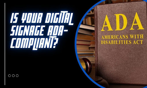
Your screens look great. Your content is on-brand. You’re reaching the right audience at the right time. But are your displays actually accessible? Most businesses skip over ADA compliance when they roll out digital signage. Not out of malice. Out of habit. They’re focused on messaging and design—compliance doesn’t even cross their radar. Until it costs them.
A single ADA violation can rack up thousands in legal fees. Even worse, non-compliance can shut out the very people your signage should be helping. That’s not a good look. This article cuts through the noise. We’ll show you what ADA-compliant signage really means, where brands slip up, and what small (but critical) changes can keep you protected.
By the time you scroll to the end, you’ll know:
- What “ADA-compliant digital signage” actually means
- Which rules apply to interactive and non-interactive screens
- Common (and costly) accessibility mistakes
- How fonts, colors, contrast, and content impact compliance
- What steps you can take right now to fix what’s broken
- How a signage platform like CrownTV can support ADA-friendly displays at scale
You don’t need to overhaul your setup. You need to tune it. Let’s walk through what that looks like — and how to pull it off without getting buried in red tape.
What ADA-Compliant Digital Signage Actually Looks Like
Accessibility isn’t optional—it’s federal law. The Americans with Disabilities Act (ADA) was designed to protect people with disabilities from discrimination. But its rules don’t stop at ramps and elevators. They stretch into technology, too, including your digital signage.
If your screen shares information with the public, the ADA likely applies. That includes wayfinding displays, directories, kiosks, menu boards, and more. Whether the content moves or stays static, the expectation is the same: make it usable for everyone.
Here’s what that looks like in practice:
- Readable text: Large enough to read at a distance, with enough contrast between text and background.
- Color choices that don’t rely on color alone: Red-green color blindness is common. Critical information can’t be conveyed through color alone.
- Audio alternatives: If there’s audio, there need to be captions. If there’s no way to hear it, it shouldn’t be the only way to access information.
- Screen placement: Displays must sit at heights and angles that accommodate people in wheelchairs.
- Touchscreen accessibility: Interactive signage must support users with limited mobility or visual impairments. That includes screen reader compatibility and tactile cues.
The ADA doesn’t spell out every spec for digital displays, but it does hold businesses accountable for equal access to information. If your content can’t be used by someone who’s blind, deaf, or using a mobility device, you’ve got a compliance gap. And that gap can get expensive.
How ADA Rules Split Between Interactive and Passive Screens

Not all screens do the same job. Some invite users to tap, scroll, and search. Others display content passively with no input needed. ADA guidelines separate these use cases—and the rules hit differently.
Let’s break it down:
For passive (non-interactive) screens:
These include menu boards, welcome screens, and digital signs that only push out content.
Here’s what they need to hit compliance:
- Readable fonts: Sans-serif, high-contrast, and large enough to read from a distance.
- Clear visuals: No flashing content, no rapid animation, and nothing that causes sensory overload.
- Content duration: Give enough screen time for viewers to read and process the info before it cycles out.
- Color contrast: Text and background should sharply contrast—a minimum 70% contrast ratio is a safe target.
- Mounting height and angle: Screens must sit within reach and sightline of wheelchair users.
For interactive screens:
Think check-in kiosks, wayfinding directories, and touchscreen ordering systems. Here’s where things get stricter:
- Reach range compliance: Users should reach controls without stretching, bending, or standing.
- Tactile feedback and audio prompts: For users with visual impairments, physical cues and voice prompts make a difference.
- Assistive tech support: The Screens should work with screen readers, braille displays, and other tools.
- Keyboard alternatives: If someone can’t use a touchscreen, there should be another way to control the screen—like a keyboard or touchpad.
Here’s the kicker: ADA doesn’t care if your screen is passive or interactive. If the content is meant for the public, it must be accessible.
Accessibility Mistakes That Rack Up Five-Figure Fines
Most accessibility issues fly under the radar—until a lawsuit hits. ADA regulations aren’t a gray area. Courts across the U.S. have made that clear. From California to New York, plaintiffs are filing accessibility claims tied to digital signage systems, and the damages? Brutal.
A single violation under the Americans with Disabilities Act can cost up to $75,000 for a first offense. What if the issue isn’t fixed? Each subsequent violation can add another $150,000. Those numbers don’t include legal fees, settlement costs, or the PR fallout that follows.
This is where most businesses fall short—and what that mistake could cost them:
- Poor contrast between text and background: Light gray text on a white screen. Yellow letters on a beige background. These combos fail basic contrast requirements and undercut visual accessibility. Cost of non-compliance: $5,000–$50,000 in settlement fees depending on the number of displays and locations.
- Text that’s too small or too compressed: If a person with low vision can’t read your message from a standard viewing distance, it doesn’t meet ADA guidelines. Many digital signage solutions still prioritize aesthetics over accessibility. Cost of non-compliance: $20,000+ when paired with font style violations.
- No audio alternative for video content: If your screen shares video with spoken instructions but no captions, Deaf and hard-of-hearing viewers are blocked from access. Cost of non-compliance: $25,000+ in damages, depending on usage and visibility of the screen.
- Mounting screens too high or too far: Displays installed above the allowed reach range—or at angles that create glare—violate ADA technical specs. This is especially common in Texas, Florida, and Arizona, where ceiling-mounted displays are the norm. Cost of non-compliance: $10,000–$30,000 for reach range violations tied to physical accessibility.
- Interactive screens without tactile or keyboard input: Touch-only kiosks are common, but without backup controls, they fail ADA standards. States like Illinois and California have seen a surge in lawsuits targeting public-facing check-in screens and ticketing kiosks. Cost of non-compliance: $50,000–$75,000 for lack of assistive alternatives.
- Relying on color to convey information: Red means stop. Green means go. But for color-blind users, that cue breaks down. ADA-compliant screens must reinforce meaning through icons or text—not color alone in accessible signage. Cost of non-compliance: $15,000+ depending on how the issue impacts user experience.
These aren’t hypotheticals. They’re patterns—and the penalties stack up fast once your screens get flagged for violating compliance standards.
The Design Choices That Quietly Break Compliance

ADA compliance isn’t always about hardware or input devices. Sometimes, it breaks down at the pixel level. Fonts, colors, contrast, and content formatting all play a direct role in accessibility. If any of those elements fall short, your signage becomes a liability.
Let’s unpack the technical side of design that most teams overlook—but the law doesn’t.
Fonts that meet the mark
Fonts do more than look good—they determine readability, especially at a distance or under poor lighting. ADA compliance requires text to be legible without visual strain, which hinges on four technical factors: typeface, size, spacing, and weight.
Here’s what meets the bar:
- Use sans-serif fonts: ADA doesn’t explicitly name preferred fonts, but industry standards lean on options like Arial, Helvetica, Verdana, and Tahoma. These fonts are free of decorative strokes, which improves clarity on low-res or glare-prone screens.
- Avoid stylized fonts: Scripts, condensed typefaces, or novelty styles (e.g., Impact, Brush Script) distort quickly when scaled or animated.
- Set a minimum x-height: This is the height of lowercase letters (like “x” or “e”). ADA-aligned signage should use typefaces with a large x-height and maintain a minimum character height of ⅝ inch (16 mm) for viewers 6 feet away. For every additional 10 feet, increase the height by 1 inch.
- Letter spacing and line height matter: Tight kerning reduces legibility. Set letter spacing to at least 0.12 times the font height and line spacing to at least 135% of the font height to support clear separation of lines.
- Use font weight strategically: Regular or bold weights are preferred. Light or ultra-thin fonts reduce legibility, especially when used in reverse color schemes (light text on dark backgrounds).
Pro tip: If your digital signage rotates between font sizes or switches styles across content slides, it disrupts reading flow. Keep font choices consistent across content categories (headers, body, labels).
Color combinations that hold up under scrutiny
Color choices directly affect readability—and failure here is one of the most common reasons signage fails ADA audits. ADA doesn’t regulate specific color combinations, but it enforces the contrast ratio between text and background. This is measured on a scale from 1:1 (no contrast) to 21:1 (maximum contrast).
Here’s what passes the compliance test:
- Text smaller than 18pt (or 14pt bold): Must maintain a contrast ratio of at least 4.5:1.
- Large text (18pt or larger): Can meet a minimum of 3:1, though higher is still better for clarity.
- Avoid color-only indicators. Never rely solely on color to convey meaning—use icons, patterns, or text labels in addition to hues. For example, instead of a red warning icon alone, pair it with a triangle or the word “Alert.”
- Don’t use similar hues or brightness levels. Red on orange, blue on purple, or white on yellow all fail under most contrast tests. Tools like the WebAIM Contrast Checker can flag combinations that fall short.
- Plan for variable lighting. Screens in sunlit lobbies, near reflective glass, or outdoors need higher contrast than those in dim indoor settings. Matte color palettes and anti-glare surfaces can help reduce contrast distortion.
Pro tip: Test your content in grayscale. If the information still holds up, you’ve likely met the standard.
Content formatting that supports accessibility
Accessible design isn’t just about static elements—it includes how content behaves, moves, and gets consumed over time. Here’s what that means in practical, compliance-backed terms:
- Information must be digestible within 5–7 seconds: If a message rotates before viewers can read it, it’s not accessible. For longer messages, extend the display duration or break the content into smaller segments.
- Limit animation speed and frequency: ADA aligns with WCAG (Web Content Accessibility Guidelines), which recommend avoiding flashing content over 3 times per second. Anything faster can trigger seizures or disorientation.
- Use consistent hierarchy and layout: Headings, bullet points, and sections should stay in predictable locations across content cycles. If a viewer can’t tell where to look, they lose context.
- Avoid excessive all-caps text: While acceptable for short headers, all-caps body text reduces reading speed by up to 20%. Use title case or sentence case for anything over a few words.
- Add alternative formats for critical content: For example, pairing audio instructions with captions or offering screen reader–compatible PDFs via QR code.
Pro tip: Use a content style guide for your compliance signage team. It should include rules on text length, structure, animations, and hierarchy to prevent accessibility issues from slipping through during content updates.
How to Fix Compliance Issues Before They Cost You

ADA compliance isn’t a design trend—it’s a legal requirement. But most signage teams don’t know where to begin once they realize their screens fall short. Good news: You don’t need to rip everything out. You need to audit, adjust, and systemize.
Here’s how to take control now, before a violation spirals into legal trouble.
Audit your current signage
Start with a full sweep. Review every display—digital directories, kiosks, welcome boards, menu screens, and anything public-facing.
Check for these issues:
- Text that is too small to read at intended viewing distances
- Poor contrast between background and foreground colors
- Overreliance on color cues without labels or symbols
- Screens mounted too high or angled improperly
- Video or audio with no captions or transcript
- Interactive displays that don’t support alternative input methods
Use accessibility testing tools like the WCAG contrast checker or screen reader simulations to spot hidden issues.
Fix content issues first
Design updates are faster and cheaper than hardware replacements. Begin by updating your content templates to:
- Use accessible font sizes and styles
- Replace color-only indicators with icon-text combinations
- Adjust screen durations to allow enough time for message consumption
- Eliminate or rework animations that flash too quickly or move erratically
- Add captions to all video or audio content
If your signage system uses scheduling software or templates, build in rules that lock accessibility best practices into place for all future updates.
Check screen placement and mounting specs
Review your physical setup using ADA-referenced reach ranges. As a baseline:
- Screens should be no higher than 48 inches from the ground (measured to the control point)
- Angle displays to minimize glare and improve sightlines
- Ensure that users in wheelchairs can both see and reach the content comfortably
If you’re unsure, consult with an ADA inspector or licensed installer to validate compliance based on local building codes.
Upgrade interactivity where needed
For touchscreen kiosks or digital directories, input flexibility is key. Add or enable:
- External keyboards or touchpads
- Screen reader support
- Tactile buttons or haptic feedback
- Audio instructions paired with visual cues
Most non-compliance cases around interactivity happen because screens assume every user can tap, swipe, and scroll. Build in redundancy. It protects your business and improves UX across the board.
Create an accessibility compliance checklist
Standardize your process. Build a checklist for new installs, software updates, and content changes that includes:
- Contrast testing
- Font and size requirements
- Text duration rules
- Interactive functionality review
- Physical screen height verification
Make this part of your signage team’s normal QA process, not a one-time fix.
ADA enforcement isn’t going away. But with the right moves, you can protect your brand, support all users, and stay ahead of compliance risks before they escalate.
Scaling ADA Compliance with the Right Signage Platform
Fixing accessibility issues across one screen is manageable. Fixing them across dozens—or hundreds—of digital signage displays? That takes more than good intentions. It takes a platform built to handle compliance at scale without burning hours or introducing risk.
This is where most providers fall short. They’ll sell you screens and content tools, but they don’t back it up with ADA-aligned workflows or verified accessibility features. That leaves your team guessing—and your business exposed.
CrownTV was built differently. Here’s how we help teams put compliance on autopilot across every display and every location.
A centralized dashboard with global control
Managing accessibility settings across dozens of endpoints is complex. But CrownTV’s secure, cloud-based dashboard lets you update, monitor, and push compliant content to every screen in your network—no matter where it’s installed.
You can:
- Set default font sizes, contrast ratios, and animation settings
- Schedule ADA-approved content templates company-wide
- Lock in display timeframes to meet text readability standards
- Group screens by location, format, or compliance level
One digital signage software. Total control. No guesswork.
A signage player that doesn’t miss
The CrownTV media player handles content delivery with precision timing and consistent playback, which matters more than you’d think. When ADA guidelines require captions to sync correctly or content to loop without glitches, performance matters. Our player holds up.
- Supports captioned content and audio alternatives
- Delivers smooth transitions with no flashing violations
- Built to maintain settings that meet ADA visibility thresholds
Displays that meet physical accessibility standards
Mounting height. Viewing angles. Brightness calibration. These aren’t just hardware specs—they’re compliance factors. CrownTV sources commercial-grade displays designed to meet ADA requirements right out of the box.
- Custom screen sizes for tighter spaces or wheelchair-accessible zones
- Anti-glare coatings to maintain contrast in high-light environments
- Adjustable brightness for both indoor and outdoor use
We don’t sell consumer TVs with a new sticker. We supply hardware that’s ready for public use—and verified for accessibility.
Turnkey service with compliance baked in
Most signage providers leave you to figure out ADA specs on your own. CrownTV takes the guesswork off your plate. With our white-glove turnkey services, we handle:
- Screen placement based on ADA reach range guidelines
- Component sourcing that matches compliance needs
- System configuration aligned with accessibility checklists
- Onsite or remote setup support for interactive displays
From planning to installation, we make sure nothing slips through the cracks.
If ADA compliance matters to your organization—and it should—build your signage system on a platform that puts accessibility first, not last. CrownTV is one of the few providers that doesn’t treat ADA as an afterthought. We bake it into every layer of the process so you can scale your ADA digital signage network without putting your brand or legal standing at risk.
Conclusion: Make ADA Signage Compliance Simple With CrownTV
ADA compliance isn’t a luxury add-on. It’s a baseline requirement—and a powerful way to make your content reach everyone who walks past your screen. You’ve made it through the critical steps, technical criteria, and legal risks. If you’ve read this far, you’re already ahead of most.
At this point, you know what to look for and what to fix. Now, it’s about using the right tools to take accessibility from an afterthought to a built-in feature of your accessible digital signage strategy.
Here’s a quick recap of what we covered:
- ADA applies to digital signage, both interactive and non-interactive
- Common mistakes include poor contrast, tiny fonts, inaccessible placement, and lack of input alternatives
- Design choices like font weight, color ratios, and animation speed directly impact compliance
- Compliance isn’t just legal—it’s ethical and smart business
- Fixes start with audits, formatting updates, and clear content guidelines
- Scaling ADA compliance is only practical with a signage platform built to support it
CrownTV makes that possible. Our platform, hardware, and hands-on services give you everything you need to build effective ADA-compliant signage at scale without second-guessing the rules or slowing down operations. You’ve put the time into understanding compliance. Now put the right system behind it.