Navigating a large college campus can be a challenge for students, faculty, and visitors alike. Inefficient wayfinding systems can lead to frustration, wasted time, and a negative overall experience. But it doesn’t have to be this way.
In this article, we’ll explore five cutting-edge wayfinding solutions that are transforming college campuses into easily navigable spaces. These campus wayfinding strategies not only improve efficiency but also contribute to a more positive and welcoming campus environment.
Here’s a glimpse into the solutions we’ll be discussing:
- Directional Signs: Clear, concise, and strategically placed signage to guide individuals seamlessly across campus
- Interactive Signs: Leveraging technology for real-time updates and personalized navigation assistance
- Map Signs: Traditional but effective, especially when designed with user experience in mind
- Staircase Graphics: Transforming underutilized spaces into informative and engaging wayfinding tools
- Emergency Signs: Prioritizing safety with clear and accessible emergency signage
Let’s explore how these solutions can help create a campus where everyone can easily find their way using the campus wayfinding signage.
Directional Signs: Your Campus Compass
Think of directional signs as your trusty campus compass, always pointing you in the right direction. They’re the unsung heroes of university wayfinding, silently guiding countless prospective students, faculty, and visitors through the sometimes sprawling labyrinth of college campuses.
But, let’s face it, not all directional signs are created equal. A poorly designed or misplaced sign can leave you feeling more lost than ever. That’s why it’s crucial to get them right.
The Power of Clarity & Visibility
When it comes to directional signs, clarity and visibility are key. Imagine you’re rushing to class, late as usual (no judgment!). You need to find the elusive “Room 302” in a building you’ve never set foot in before. A well-placed, easy-to-read directional sign can be a lifesaver in such moments.
- Keep it Simple: Use clear, concise language. Avoid jargon or overly complex wording that might leave people scratching their heads.
- Size Matters: Make sure the signs are large enough to be seen from a distance, especially at key decision-making points like intersections or building entrances.
- Strategic Placement: Think like a student. Where would you need a sign to point you in the right direction? Consider high-traffic areas, confusing intersections, and building entrances.
A study found that 76% of students felt that clear signage was important for navigating campus. So, it’s not just about aesthetics; it’s about creating a positive user experience.
Accessibility & Inclusivity
Directional signs should be accessible to everyone, regardless of ability. Consider incorporating features like:
- Braille and Tactile Lettering: For those with visual impairments.
- High-Contrast Colors: To improve visibility for those with low vision.
- Simple Pictograms: To convey information quickly and universally.
By making your directional signs inclusive, you’re ensuring that everyone feels welcome and can navigate your university campus with confidence.
Interactive Signs: Your Digital Campus Guide

Let’s step into the 21st century, shall we? While traditional directional signs are essential, interactive signs take campus wayfinding to the next level. These high-tech marvels leverage technology to provide real-time updates, personalized navigation assistance, and a whole lot more.
The Power of Real-Time Updates
Imagine this: a major event is taking place on campus, causing road closures and detours. With interactive signs, you can instantly update the information displayed, ensuring everyone stays in the loop and avoids unnecessary confusion.
These signs can also integrate with campus calendars and schedules, displaying relevant information based on the time of day or current events. Talk about staying ahead of the curve!
Personalized Navigation Assistance
Interactive signs can be equipped with touchscreens, allowing users to search for specific locations, get directions, and even view estimated travel times. Some advanced systems even offer personalized navigation assistance based on the user’s profile or preferences, further integrating wayfinding solutions into the daily campus experience.
For example, a student who frequently visits the library could set the library as a favorite location, allowing for quick and easy access to directions. Similarly, a visitor with a disability might be able to select accessibility options, such as wheelchair-accessible routes or elevator locations, taking into account the unique campus layout.
Interactive signs can also integrate with mobile apps, providing users with the ability to access campus maps, search for points of interest, and receive real-time updates directly on their smartphones. This seamless integration enhances the overall user experience and makes utilizing campus wayfinding signage even more convenient.
More Than Just Directions
Interactive signs can do so much more than just provide directions. They can also:
- Display campus news and announcements: Keep everyone informed about important events and updates.
- Showcase campus maps and directories: Help users visualize their location and find points of interest.
- Provide emergency alerts and safety information: Ensure the safety and well-being of everyone on campus.
According to a study, 85% of students found interactive wayfinding kiosks to be helpful in navigating campus. So, it’s clear that these high-tech solutions are making a real difference.
The Future of Wayfinding
Interactive signs represent the future of campus wayfinding, offering a level of convenience, flexibility, and personalization that traditional signs simply can’t match. As technology continues to advance, we can expect to see even more innovative and exciting developments in this field. For instance, the integration of augmented reality (AR) could provide users with immersive, interactive wayfinding experiences. Imagine being able to point your smartphone at a building and see real-time directions overlaid on the image.
Additionally, advancements in artificial intelligence (AI) could enable interactive signs to learn and adapt to user behavior, providing even more personalized and efficient navigation. As technology continues to evolve, the possibilities for interactive signs are endless, and we can look forward to a future where navigating campus is not just efficient but enjoyable and engaging.
Map Signs: The Classic Campus Navigator
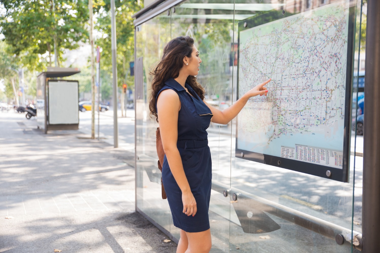
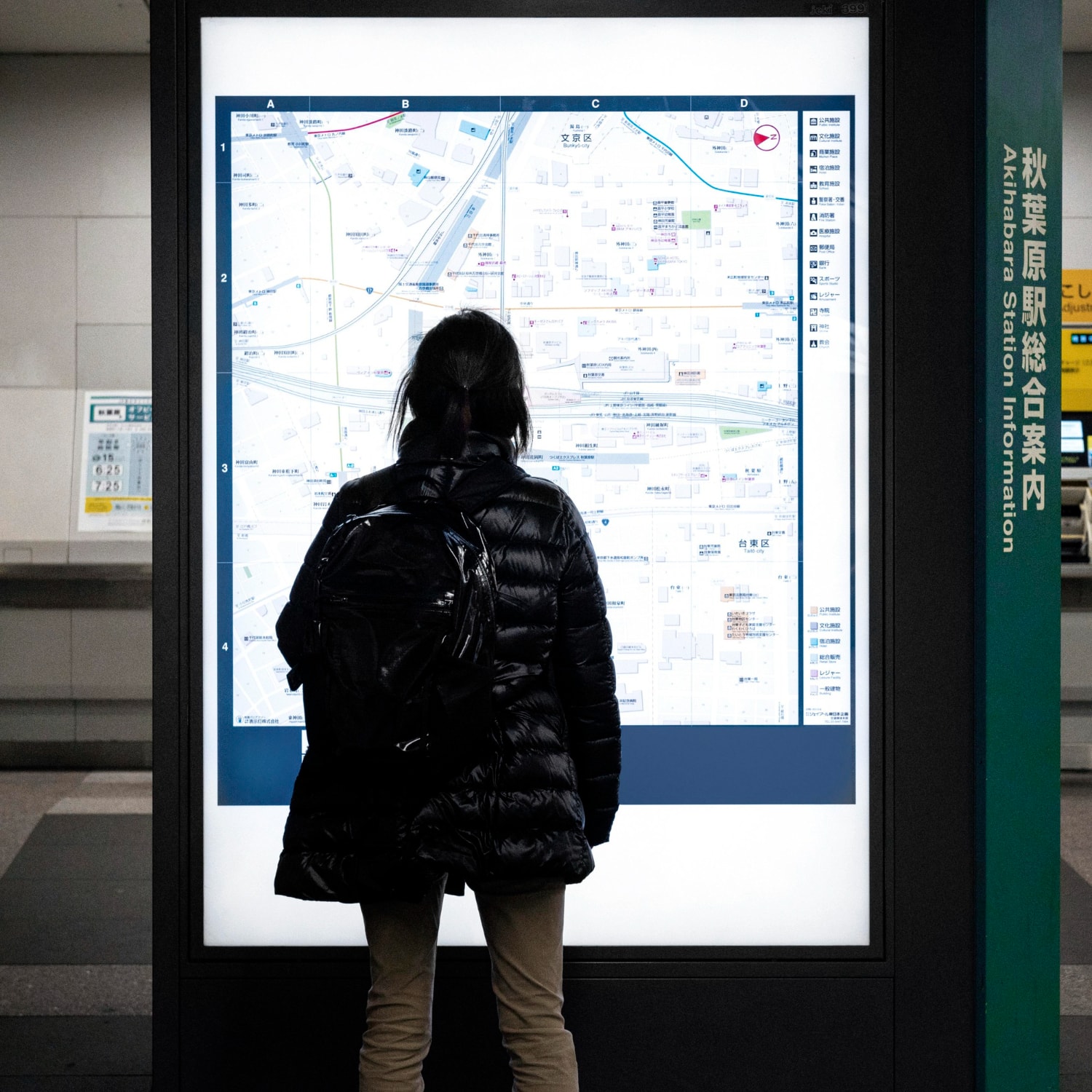
Sometimes, the old ways are still the best. While we’ve explored the wonders of digital wayfinding, let’s not forget the humble map sign. These classic campus navigators might seem old-school, but they remain an effective tool, especially when designed with user experience in mind.
Why Map Signs Still Matter
In a world of smartphones and GPS, you might wonder why map signs still hold their ground. Well, consider this:
- No Batteries Required: Unlike your phone, a map sign won’t die on you in the middle of your campus quest.
- The Big Picture: Maps provide a comprehensive overview of the campus, helping you visualize your location and plan your route.
- Universally Accessible: Everyone can understand a map, regardless of their tech-savviness or language skills.
Designing Map Signs That Work
A well-designed map sign can be a lifesaver. Here are some tips for creating maps that truly guide:
- Keep it Simple: Declutter your map. Focus on essential landmarks and routes, avoiding unnecessary details that might overwhelm users.
- Orient It Right: Make sure the map is oriented correctly, with “north” pointing in the actual north direction. A disoriented map is a recipe for confusion.
- “You Are Here”: Include a clear “You Are Here” marker so users can easily pinpoint their location on the map.
- Legend and Symbols: Use a clear legend to explain the symbols used on the map. Consider using universally recognized symbols whenever possible.
- Accessibility: Ensure the map is accessible to individuals with disabilities, including those with visual impairments. Consider incorporating tactile elements or providing alternative formats.
A study found that 89% of visitors used campus maps to navigate, demonstrating their continued importance in wayfinding.
Combining the Old and the New
While map signs might seem traditional, they can seamlessly integrate with modern technology. Consider adding QR codes to your interactive campus maps, linking to interactive digital versions or providing additional information about specific locations. This blend of old and new creates a more dynamic and user-friendly experience.
Map signs remain a valuable tool in the wayfinding arsenal, offering a reliable and accessible way for people to orient themselves and explore your campus. By prioritizing user experience in your map design, you can ensure that these classic navigators continue to serve their purpose effectively for years to come.
Staircase Graphics: Wayfinding That Elevates

Who says staircases are just for climbing? Let’s turn those often-overlooked spaces into vibrant, informative wayfinding tools. Staircase graphics offer a creative and engaging way to guide people, while also adding a touch of personality to your campus.
Staircase graphics can serve multiple purposes, from providing directional cues to showcasing campus history or promoting sustainability initiatives. Imagine ascending a staircase adorned with a timeline of your university’s milestones, or descending one filled with inspiring quotes from notable alumni. The possibilities are endless.
Benefits Beyond Wayfinding
Staircase graphics offer more than just practical guidance. They can also:
- Enhance the aesthetic appeal of your campus: Transform dull stairwells into eye-catching works of art.
- Create a sense of place and identity: Showcase your university’s unique history, culture, and values.
- Promote health and wellness: Encourage physical activity by making stair climbing more enjoyable.
A study found that staircase graphics increased stair use by 25%, highlighting their potential to promote healthier lifestyles on campus.
Design Tips for Staircase Graphics
To maximize the impact of your staircase graphics, consider the following tips:
- Choose the right location: Select staircases with high visibility and traffic flow.
- Develop a clear message: Decide what you want to communicate with your graphics.
- Use high-quality materials: Ensure your graphics are durable and can withstand wear and tear.
- Incorporate interactive elements: Consider adding QR codes or augmented reality features to engage users further.
Staircase graphics are a creative and effective way to transform underutilized spaces into valuable wayfinding tools. By incorporating thoughtful design and engaging content, you can elevate the campus experience for everyone.
Emergency Signs: Safety First, Always
In any campus environment, safety is paramount. That’s where emergency signs step in, playing a crucial role in guiding people to safety during critical situations. In the digital age, these signs have evolved beyond static displays, incorporating technology to provide real-time alerts and critical information.
Traditional emergency signs are still essential, but digital versions take safety communication to the next level. These dynamic displays can:
- Broadcast real-time alerts: Instantly notify everyone on campus about emergencies, severe weather warnings, or active shooter situations.
- Provide evacuation routes and safety instructions: Guide people to the nearest exits or safe zones with clear visual cues and instructions.
- Display critical information: Show emergency contact numbers, first aid locations, or other relevant details.
The Clery Act, a federal law requiring colleges and universities to disclose campus crime statistics, also mandates timely warnings about ongoing threats. Digital emergency signs can be a crucial tool in fulfilling this requirement.
Accessibility is Key
Emergency signs must be accessible to everyone, including individuals with disabilities. Consider the following accessibility features before implementing the university wayfinding system:
- Visual clarity: Use high-contrast colors and large, easy-to-read fonts.
- Audible alerts: Include audible alarms or voice announcements to reach those with hearing impairments.
- Tactile elements: Incorporate Braille or raised lettering for those with visual impairments.
- Strobe lights: Use flashing lights to alert individuals with visual or hearing impairments.
Placement Matters
Strategic placement of emergency signs is critical. Ensure they are:
- Visible from all angles: Place signs at eye level and in well-lit areas.
- Located at key decision-making points: Install signs near exits, stairwells, elevators, and other high-traffic areas.
- Strategically distributed throughout campus: Ensure adequate coverage across all buildings and outdoor spaces.
Interactive Emergency Systems
Some advanced digital emergency signs even offer interactive features, such as:
- Touchscreen interfaces: Allow users to access additional information or report emergencies directly.
- Two-way communication: Enable communication between individuals in distress and emergency responders.
- Integration with other systems: Connect with building automation systems to trigger alarms, unlock doors, or adjust lighting during emergencies.
By leveraging technology and prioritizing accessibility, digital emergency signs can significantly enhance campus safety and preparedness. In a critical situation, these signs can truly make all the difference, providing clear guidance and potentially saving lives.
Conclusion: Your Campus, Reimagined
As you can see, effective wayfinding isn’t just about helping people get from point A to B; it’s about shaping their entire campus experience. It’s about creating a sense of belonging, fostering a welcoming environment, and empowering everyone to navigate your campus with confidence and ease.
So, let’s ditch the outdated maps and confusing signage. Let’s embrace innovative solutions that truly elevate the wayfinding experience. From directional signs and interactive kiosks to map signs, staircase graphics, and digital emergency alerts, there’s a whole world of possibilities waiting to be explored.
Key Takeaways:
- Clarity and Visibility: The foundation of effective wayfinding lies in clear, concise, and strategically placed signage.
- Embrace Technology: Interactive signs offer real-time updates, personalized navigation, and a host of other benefits.
- Don’t Forget the Classics: Map signs remain a valuable tool, especially when designed with user experience in mind.
- Think Outside the Box: Staircase graphics transform underutilized spaces into engaging wayfinding tools.
- Safety First: Prioritize safety with clear, accessible, and technology-driven emergency signage.
By implementing these wayfinding solutions, you’re not just improving navigation; you’re creating a campus that’s welcoming, inclusive, and safe for everyone. And if you’re looking to take your campus wayfinding system to the next level, consider partnering with a digital signage provider like CrownTV. Our comprehensive solutions, including advanced cloud-based software (dashboard), indoor and high-brightness window displays, and expert installation, can seamlessly integrate with your existing wayfinding infrastructure.
With CrownTV, you can create dynamic, interactive displays that provide real-time updates, personalized navigation assistance, and even emergency alerts. Plus, Our digital signage implementation services ensures a hassle-free implementation process, from content creation to ongoing support. With a wide range of display options, mounting solutions, and integrations with popular apps and media player, CrownTV empowers you to create a truly connected and navigable campus.

