In 2024, it’s not just about flashing offers and logos; it’s about crafting stories that resonate and creating experiences that stick. If you’re looking to master the art of digital signage design, you’re in the right place. Here’s what we’ll dive into:
- The core principles guiding digital signage design
- Real-world examples from top-notch companies
- Innovative tools and software enhancing design efficiency
- Pro tips and best practices for impactful content creation
By the end of this guide, you’ll be equipped to transform any space into a dynamic interaction hub, captivating your audience at every glance. Let’s shape the future of your digital displays.
The 13 Rules for Designing Digital Signage Content
The 13 rules for designing digital signage content are designed to guide you through this process. Each rule focuses on enhancing viewer engagement. Whether you’re promoting special offers, providing informational content, or enhancing brand recognition, these guidelines will help you create dynamic, effective digital displays that resonate with your audience.
1. Focus on Dynamic Digital Signage Content
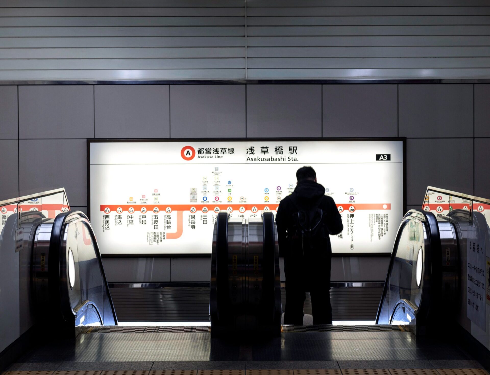
Dynamic digital signage content is a modern approach to advertising where digital displays, such as TV screens or digital signage screens, are used to present visually appealing and engaging content. This content can be easily updated and altered, making it “dynamic.” To create dynamic signage content, follow these steps:
- Design Elements: Start with a clear design. Use a drag-and-drop interface for ease. Keep visual clutter to a minimum. Use light text on dark backgrounds for better picture quality and readability.
- Content: Create engaging content that captures your target audience’s attention. This could include user-generated content, social media feeds, news feeds, or advertising specific to your brand.
- Resolution: Ensure your digital content matches the display resolution of your digital signage display. Standard pixel dimensions vary based on screen resolution, so check your digital signage system’s specifications.
- Fonts: Choose clear, easy-to-read font sizes. Serif fonts are often a good choice.
- Images: Use high-quality background images and image overlays. Remove undesirable things by objectremover to keep your background clean. Be mindful of image file size to avoid slowing down your digital signage systems.
- Social Media Integration: Incorporate social media platforms to display real-time social media content, enhancing customer engagement. It is one of the best practices for digital signage design that you can use freely.
2. Incorporate Interactive Elements
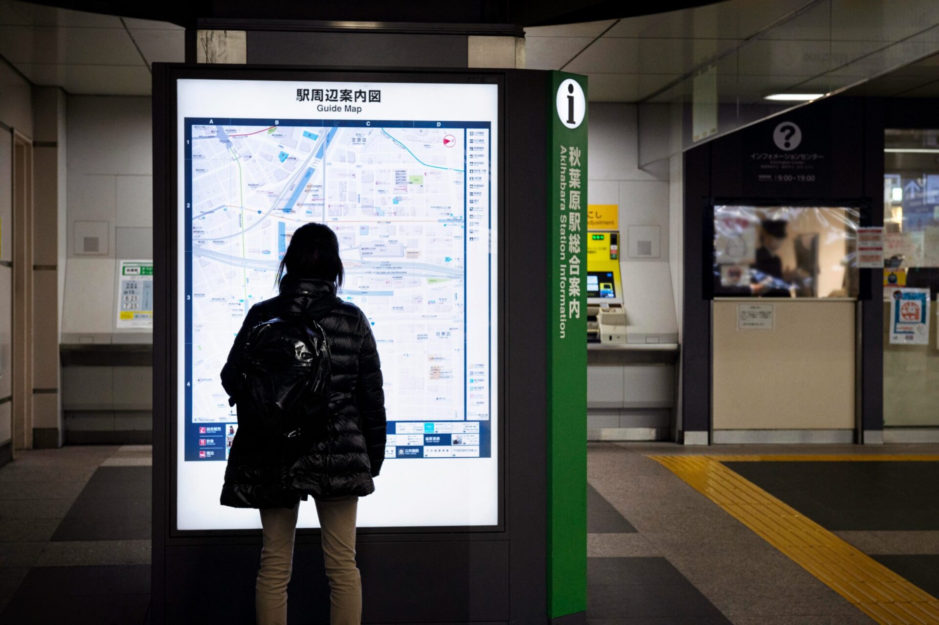
Incorporating interactive elements into your digital signage design can significantly enhance customer engagement and the overall user experience. Here’s how you can use interactive elements in digital signage.
Touch Screen Displays and QR Codes
Consider using touchscreen digital signage displays. This allows users to interact directly with the content, making the experience more engaging and personalized. Incorporate QR codes into your digital signage content. When scanned, these can lead to your website, social media platforms, or specific promotions.
- Engaging Experience: Touchscreen displays allow users to interact directly with your content, providing a hands-on and immersive experience that captivates attention and encourages exploration.
- Personalized Engagement: Users can navigate through menus, browse products, or access additional information at their own pace, creating a personalized and tailored experience that meets their individual needs and preferences.
- Increased Dwell Time: The interactive nature of touchscreen displays encourages prolonged engagement, leading to increased dwell time and deeper interactions with your brand.
Interactive Menus
According to Experts at CrownTV, it is important to use interactive menus with dynamic text sizing, more pixels, and open space to place elements strategically. The purpose is to streamline your signage.
For businesses like coffee shops or restaurants, digital menu boards can be made interactive. Customers could customize their orders right on the screen. That way, your digital signs become more interactive.
Tips to maximize the effectiveness of your interactive menus:
- Use Responsive Design: Ensure your digital menus are responsive across all devices. This means they should be easily navigable on tablets mounted on walls or counters, as well as on mobile devices.
- Incorporate Real-Time Updates: Equip your menus with the ability to update in real-time. This is particularly useful for displaying current wait times, changing the availability of specials, updating prices, and keeping your service dynamic and responsive to customer needs and inventory.
- Engage with Visuals: Include high-quality images and videos of menu items. Visual aids not only enhance appeal but also help in faster decision-making and can boost sales of featured items.
- Leverage Analytics Tools: Utilize tools like Google Analytics for digital signage to track which menu items get the most interaction and which features are used most frequently. This data can help you refine your offerings and layout.
Augmented Reality (AR)
AR can be used to create engaging and immersive experiences. For instance, a clothing store could use AR on its digital screens, allowing customers to virtually try on clothes.
Remember, the goal of interactive elements is to engage customers, provide value, and enhance their experience. Always keep your target audience in mind when designing your digital signage content.
Strategies to effectively incorporate AR into your digital signage:
- Tailor AR Experiences: Customize AR features to align with the specific needs and interests of your customer base. For example, in a home decor store, AR can be used to show how different furniture pieces would look in a customer’s own living space.
- Simplify Interaction: Ensure that the AR interface is user-friendly. Use intuitive gestures and straightforward navigation to make the AR experience accessible to all users, regardless of their tech capacity.
- Incorporate Real-Time Feedback: Offer real-time visual feedback through AR, such as showing how a piece of clothing fits or how a makeup product looks. This can significantly enhance decision-making and boost customer confidence.
- Promote Social Sharing: Enable features that allow users to take snapshots of their AR experiences and share them on social media. This not only enhances user engagement but also serves as a free promotion for your brand.
- Utilize Analytics: Deploy analytics tools to gather data on how customers interact with AR features. This information can guide further refinements, ensuring that the AR elements continue to meet customer expectations and drive engagement.
3. Use Data-Driven Content for Digital Signage
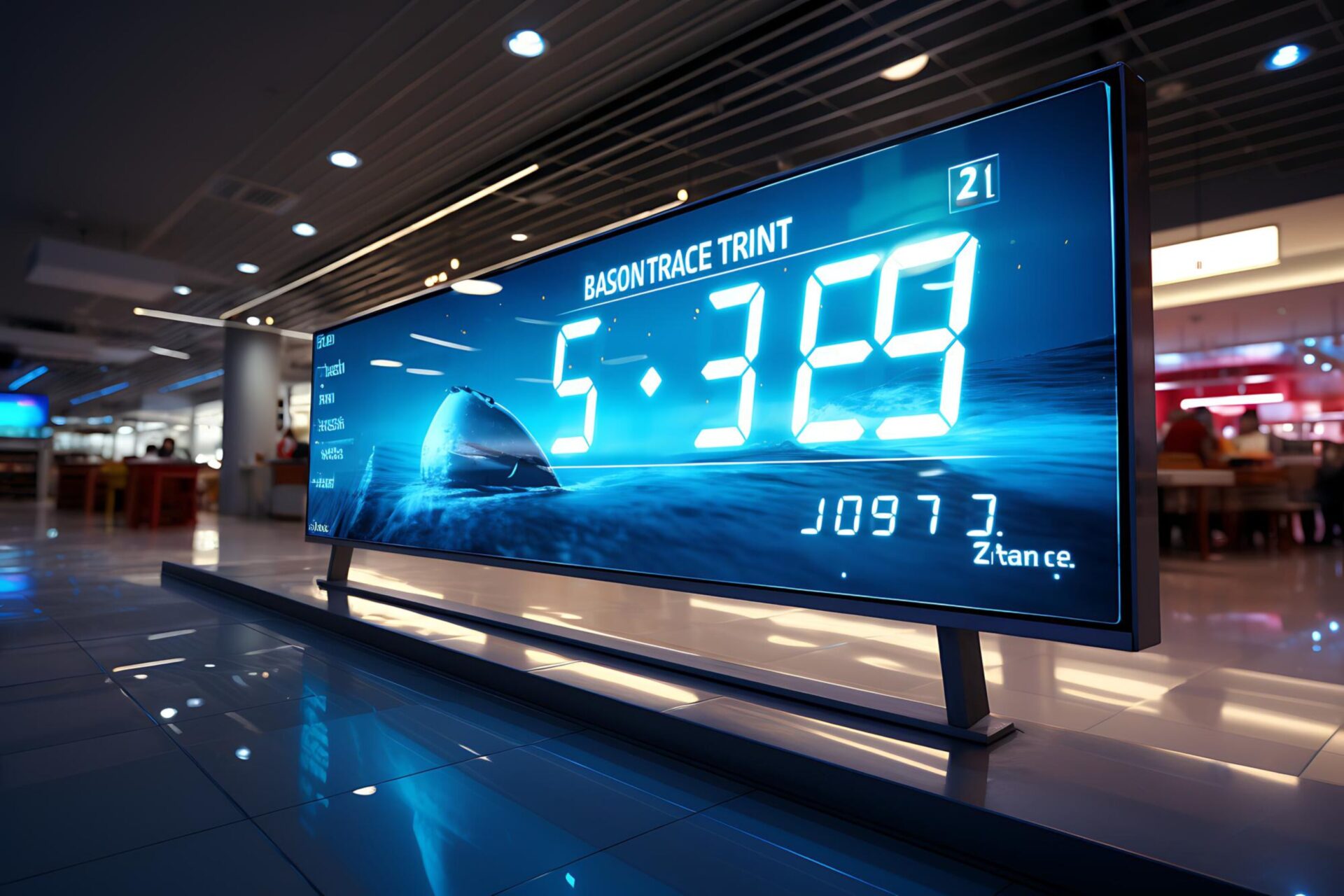
Utilizing data-driven content in digital signage is about harnessing real-time data to craft content that is both relevant and engaging.
By effectively identifying and integrating the right types of data—such as sales figures, customer feedback, social media interactions, and even weather forecasts—you can significantly enhance the user experience. The goal is to select data that not only resonates with your audience but also adds substantial value to their interaction with your brand.
To implement this effectively, choose a digital signage system that supports robust data integration. This technology enables your digital displays to automatically update based on real-time data changes, ensuring that the content remains fresh and relevant.
Tips to optimize your data-driven digital signage content:
- Select Relevant Data Sources: Determine which data points are most relevant to your audience. For instance, a cinema might use real-time box office statistics to promote top-selling movies or upcoming releases.
- Automate Data Updates: Ensure your digital signage system can automatically refresh content based on the latest data. This keeps your displays current without manual intervention, reducing overhead and enhancing accuracy.
- Monitor and Adapt: Continuously track the performance of your data-driven content. Analyze engagement metrics to understand what works and what doesn’t. Adjust the visual design, data points displayed, and update frequency to better meet your audience’s needs.
- Visual Appeal: Present data in an aesthetically pleasing manner. Use charts, graphs, and infographics to make complex data easily digestible and engaging.
- Interactive Elements: Incorporate interactive elements such as touchscreens to allow users to explore data in more depth. This can increase engagement and provide a deeper connection with the content.
4. Design for Accessibility
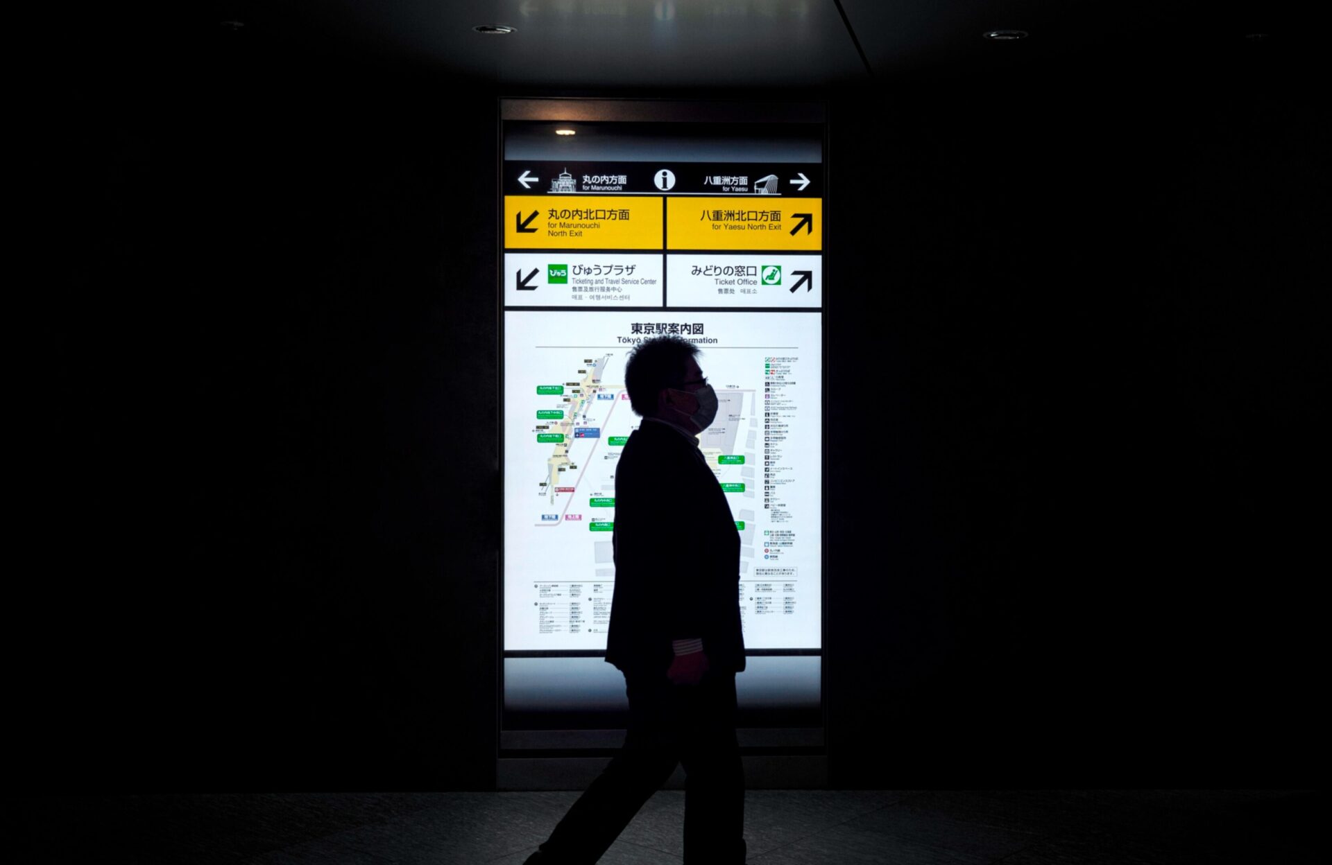
To optimize your digital signage, start by gaining a deep understanding of your target audience. This includes identifying their needs, preferences, and potential impairments. Such insights will help you tailor your content to be inclusive and accessible to everyone, including those with specific needs.
Keep It Simple and Clear: Avoid visual clutter by using a straightforward layout for your digital signage. A clean and simple design helps make your content more digestible and can significantly aid individuals with cognitive impairments.
Consider Display Resolution and Screen Size
The effectiveness of digital signage also heavily depends on the display resolution and screen size. Ensure your content is designed to be visible and legible across all displays. This consideration is crucial for accessibility, as it ensures that everyone, regardless of their visual ability, can easily interact with your signage.
High-Contrast Colors: Implementing high-contrast color schemes (such as light text on dark backgrounds or vice versa) is essential for enhancing readability. This strategy is particularly beneficial for people with visual impairments, as it helps distinguish textual content and interactive elements clearly.
Incorporate Audio Descriptions
For digital content that includes visual elements, consider adding audio descriptions. These descriptions narrate what is happening on the screen and are especially useful for people with visual impairments. Audio descriptions not only make your digital signage more accessible but also enrich the user experience, making your content more inclusive.
Use Accessible Fonts
Choosing the right fonts is crucial for readability. Opt for fonts that are easy to read and feature clear distinctions between characters. Avoid overly stylized fonts, as they can be challenging to decipher and may alienate users with visual impairments or dyslexia.
Practical implementation tips:
- Test Your Designs: Regularly test your signage with a diverse group of users, including those with impairments, to gather feedback on its accessibility and effectiveness.
- Stay Updated on Accessibility Guidelines: Follow the latest ADA guidelines and web content accessibility guidelines (WCAG) to ensure your digital signage meets current standards.
- Continuous Learning and Adaptation: Stay informed about new tools and technologies that enhance accessibility, such as screen readers and alternative input devices for interactive digital signage.
5. Consider Environmental Factors

Effectively deploying digital signage requires careful consideration of environmental factors that influence visibility and engagement. Understanding these aspects ensures your signage delivers optimal performance and reaches your audience effectively.
Lighting conditions
Adjust the brightness and contrast of your digital screens based on their placement:
- Outdoor Signage: For screens placed outdoors, ensure the content remains visible in varying light conditions, from bright sunlight to nighttime. Use high-brightness screens designed specifically for outdoor use, capable of overcoming direct sunlight.
- Indoor Signage: For indoor environments, consider the ambient lighting. Screens should adjust in brightness to blend seamlessly with indoor lighting conditions, avoiding glare and reflections that could impair visibility.
Viewing distance and angle
Content legibility drastically depends on how far and from what angle your audience will view the screens. Ensure that text sizing and image resolutions are optimized for typical viewing distances. For instance, larger text and clear, simple imagery are crucial for signage viewed from afar or at sharp angles to accommodate quick readability.
Tailor your content to the setting of the digital signage:
- Busy Areas: In high-traffic areas like coffee shops or malls, your digital signage should feature eye-catching, straightforward content that captures attention quickly. Use dynamic elements like moving images or bold colors to stand out, but avoid overcrowding the visual space, which can dilute the impact of your key messages.
- Weather Conditions: For outdoor displays, ensure your digital signage system is durable enough to withstand local weather conditions—be it rain, snow, or extreme temperatures. Opt for waterproof, temperature-resistant screens that maintain high performance regardless of weather.
Placement and Height
The position and height of your screens play a pivotal role in accessibility and visibility:
- Place digital signs at eye level whenever possible to facilitate easy viewing.
- Screens should be positioned in areas of high foot traffic to maximize exposure and impact. Consider the general flow of traffic in the location to ensure that the signage naturally catches the eye of passersby.
6. Keep Branding Consistent
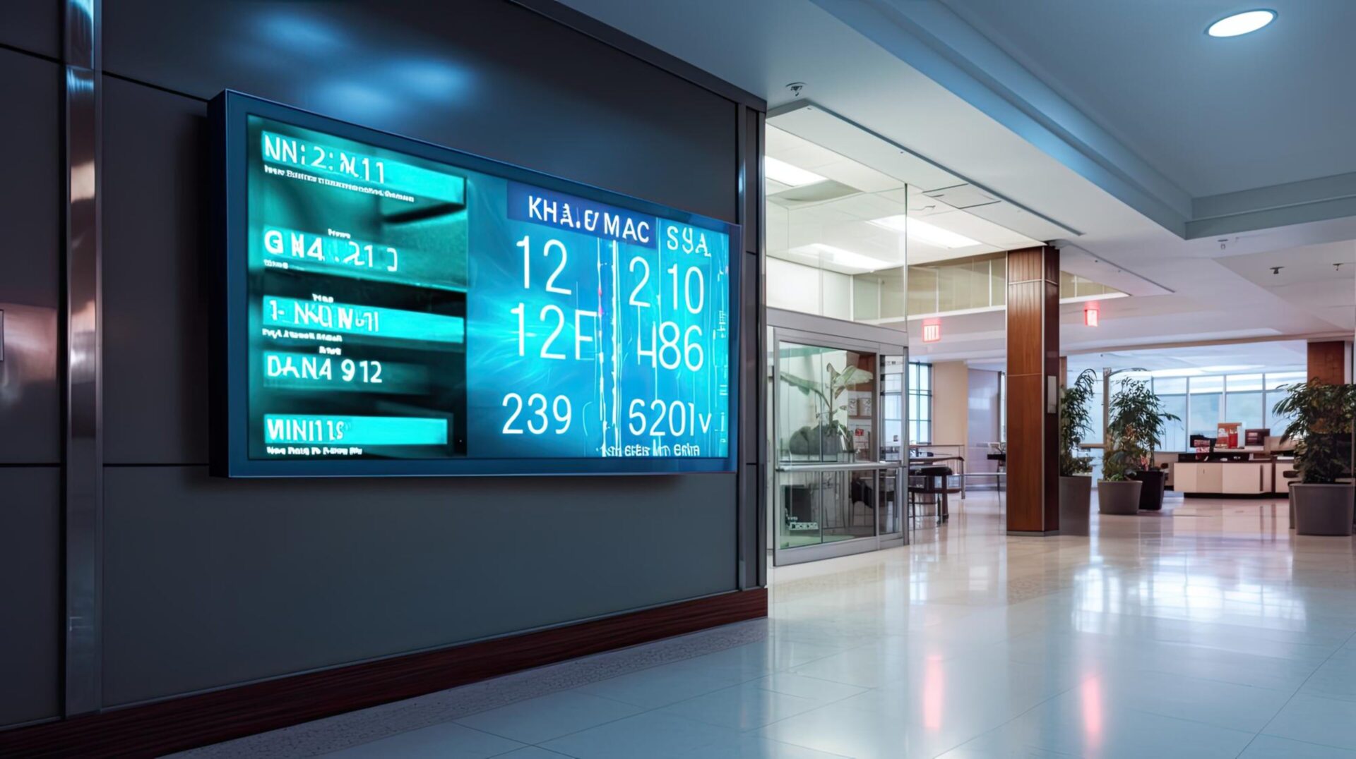
Maintaining brand consistency in digital signage design is crucial for reinforcing your brand identity and creating a cohesive customer experience. It involves ensuring that all elements of your digital signage content, from the color scheme and typography to the style of imagery and tone of voice, align with your brand guidelines.
Consistency in digital displays helps to strengthen brand recognition and trust among your target audience. Here are some strategies for maintaining brand consistency:
- Use consistent color schemes.
- Maintain consistent typography.
- Align messaging with brand voice.
- Use consistent imagery styles.
- Incorporate your logo appropriately.
- Ensure consistent layout across all digital signs.
CrownTV specializes in helping you create digital signage content that not only captures attention but also stays true to the brand’s identity. With our extensive library and templates, you can create unforgettable digital signage designs.
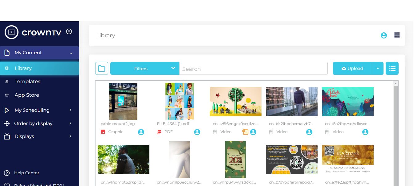
Whether it’s digital menu boards for a restaurant or engaging content for a retail store’s digital signage display, we ensure that your brand’s identity is at the forefront of every design with our streamlined solutions.
7. Use Motion Wisely

Motion in digital signage is a powerful tool that can attract attention, enhance storytelling, and create dynamic signage content. It can make your digital displays more engaging and visually appealing. However, it’s important to use motion wisely.
Too much motion can be distracting and can make your content hard to read, while too little can make your digital screens seem static and uninteresting.
Here are some strategies for using motion wisely in creating digital signage:
- Use subtle motion for background images.
- Animate key components of your content to draw attention.
- Use motion to guide the viewer’s eye through the content.
- Keep motion consistent with your brand style and tone.
- Use motion to highlight critical information.
- Avoid fast, distracting motion.
In the digital signage industry, creating a balance between static and dynamic elements is crucial. For example, you might have a static logo or key message, with motion used to highlight supporting information or create a visually appealing background.
Remember, the goal is not just to attract attention, but also to communicate effectively with your audience. So, use motion wisely to enhance your digital signage content without overwhelming your audience.
8. Use Quality Digital Signage Screens

Using quality signage screens is crucial for effectively creating digital signage content. High-quality screens ensure that your content is displayed clearly and vibrantly, enhancing the overall impact of your digital signage.
Whether you’re using indoor digital displays or outdoor window-facing displays, the quality of your screens can significantly affect how your content is perceived.
When choosing signage screens, consider these factors:
- Choose high-resolution screens.
- Consider the screen size based on the viewing distance.
- Use durable screens for outdoor digital signage.
- Ensure the screen brightness is suitable for the environment.
- Opt for screens with good color accuracy.
If you’re looking for the best high-quality screens, make sure to check out our vast collection of digital signage displays. We offer a range of digital signage screens suitable for various applications, from indoor digital displays to outdoor window-facing displays.
Our commitment to quality ensures that your digital signage content is displayed at its best, enhancing customer engagement and experience.
9. Test and Iterate Digital Signage Design

Developing effective digital signage content is a dynamic process that involves continuous testing and refinement. The initial step is to craft your design thoughtfully, incorporating diverse elements like social media feeds, visual content, and interactive features.
Design Considerations:
- Visual Contrast: Pay attention to how various elements interact visually. For example, use high contrast combinations such as dark images with light text to ensure legibility from various distances.
- Media Integration: Consider integrating different media types, such as video content, which can be displayed through embedded media players. This variety can enhance engagement and retain viewer interest.
Testing Your Design:
- Initial Screen Testing: Once your design is prepared, test it on the intended digital signage screens. Assess the overall impact and functionality—check if the layout flows logically, if the text is readable, and if the images are clear and compelling.
- Comparative Analysis: Utilize printed materials or other successful signage as a benchmark. Comparing your digital signage to proven layouts can provide insights into effective design elements and composition.
- Feedback Collection: Gather feedback from real viewers if possible. Observing how they interact with the signage, which elements catch their attention, and which aspects are overlooked can provide invaluable information.
Iterative Process:
- Refinement: Based on the feedback and your observations, refine the design. Adjust elements like the layout, font sizes, color schemes, and media quality to better meet your goals.
- Continuous Testing: Keep testing new versions of your design. Each iteration should address previous shortcomings and introduce improvements that make the signage more engaging and communicative.
The process of testing and iterating is crucial in ensuring that your digital signage meets the high standards necessary for today’s competitive visual landscape. This iterative cycle helps in refining the content to be as impactful as possible, ensuring that each element is optimized for visibility, engagement, and communication effectiveness.
10. Create a Content Schedule
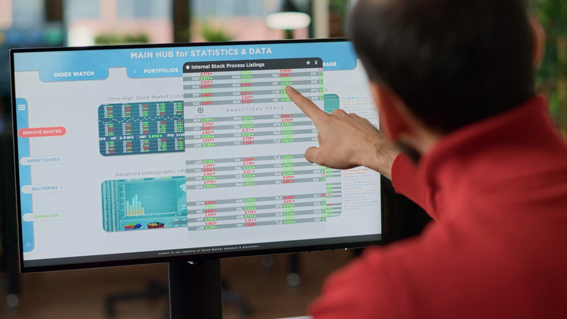
Developing a content schedule for your digital signage is vital to ensure your displays are timely, relevant, and engaging. A thoughtfully planned content schedule maximizes the impact of your digital signage, maintains audience engagement, and enhances the overall effectiveness of your system.
When planning your schedule, consider a balanced mix of content types:
- Static Images: These provide visual stability and are easy to view.
- Dynamic Content: Such as live social media feeds, which keep your content fresh and relatable.
- Video Content: Played through a media player, videos can engagingly deliver complex messages.
Maintain a consistent ratio of these content types throughout your schedule to offer a cohesive viewing experience that meets the diverse preferences of your audience.
Technical Considerations:
- Screen Resolution: Match the pixel density of your content with the resolution of your digital screens to ensure clarity and precision in content display.
- File Types Compatibility: Check that your digital signage system supports various file types needed for your diverse content, ensuring smooth playback and display.
Scheduling Content:
- Timing and Duration: Schedule each piece of content based on your audience’s viewing habits. Consider peak traffic times for maximum exposure. Each content piece should be long enough to engage the viewer but brief enough to prevent fatigue.
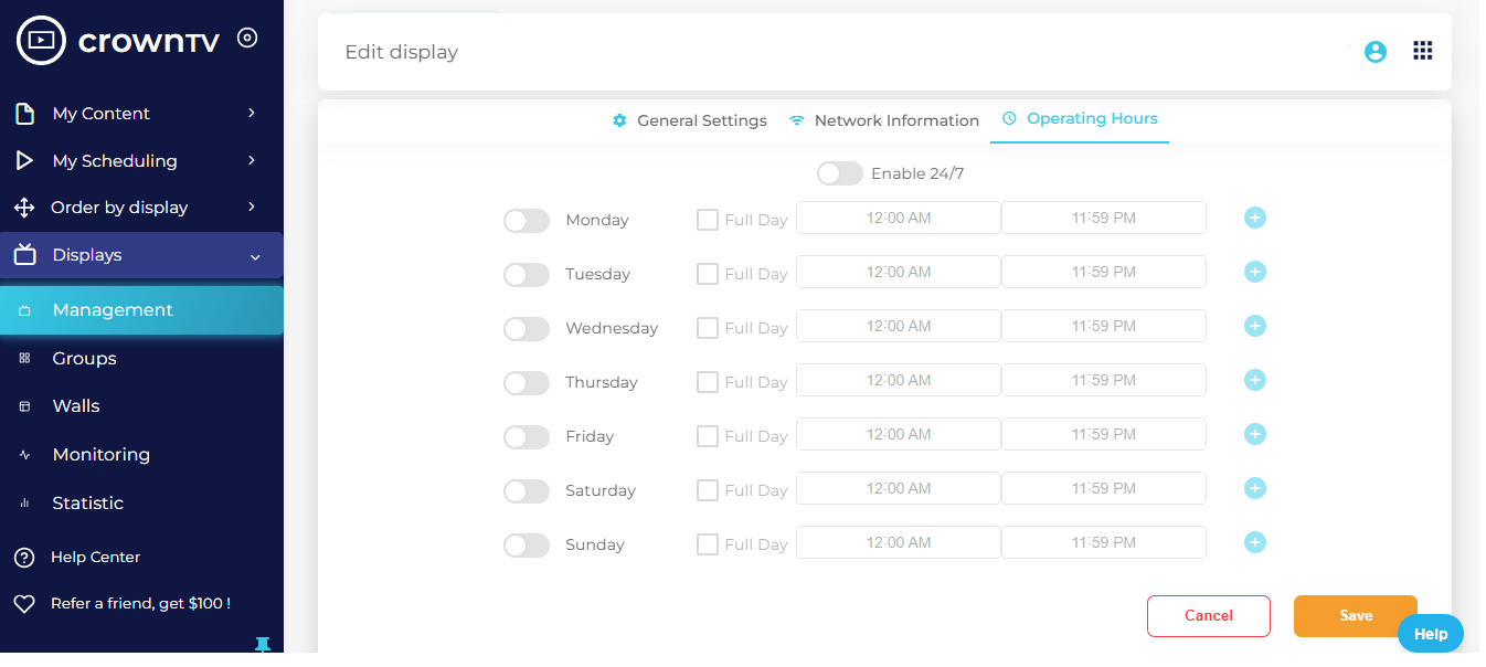
- Pro Tip: With CrownTV, you can remotely manage your digital signage displays anywhere and at any time. Monitor your content and adjust timings according to your business needs. Create the digital signage content schedule, set the time, and choose the duration all in one place.

- Pro Tip: With CrownTV, you can remotely manage your digital signage displays anywhere and at any time. Monitor your content and adjust timings according to your business needs. Create the digital signage content schedule, set the time, and choose the duration all in one place.
- Screen Dimensions: Ensure that content dimensions are perfectly calibrated to your screen size to avoid cutoffs at the edges, ensuring a professional appearance and full message delivery.
Ongoing Optimization:
- Continuously gather viewer feedback and performance data to refine your content schedule. Adjust the type, timing, and duration of content based on what resonates most with your audience.
- Regularly update and adapt your schedule to accommodate special events, promotions, or relevant news that may captivate your audience further.
By investing time in meticulously planning and regularly adjusting your content schedule, you make your digital signage more effective and engaging.
This strategic approach not only keeps your content fresh and appealing but also ensures that it aligns perfectly with the needs and interests of your viewers, thereby maximizing the return on your digital signage investment.
11. Use High-Quality Assets

The visual quality of your digital signage plays a crucial role in capturing and maintaining audience attention. High-resolution images, clear fonts, and high-quality videos not only increase the visual appeal of your signage but also enhance its overall effectiveness.
Here are some key strategies for optimizing the visual assets of your digital signage:
- High-Resolution Images and Videos:
- Resolution Matters: Always use the highest resolution possible for images and videos. This ensures that your content looks sharp and engaging, even on larger screens. High-definition assets prevent pixelation and image degradation, which are vital for maintaining a professional appearance.
- Clear, Legible Fonts:
- Font Selection: Choose fonts that are easy to read from various distances and angles. Sans-serif fonts, for instance, are often more legible in digital contexts. Avoid overly decorative fonts that can compromise readability.
- Consistent Font Size: Maintain a consistent font size across different screens to ensure that your message is easily understandable, regardless of where it’s viewed.
- Professional, Well-Designed Graphics:
- Quality Design: Opt for graphics that are professionally designed. This includes using clean lines, balanced compositions, and color schemes that are not only appealing but also align with your brand identity.
- Design for Visibility: Ensure that all graphic elements are sized appropriately for visibility from a distance. This includes button icons for interactive signage, which should be large enough to be easily tapped by users.
- Maintaining Asset Quality:
- Regular Updates: Regularly update your assets to maintain high quality and relevance. This includes replacing outdated visuals and refreshing your content to align with current trends and technologies.
- Testing and Feedback: Continuously test your digital signage in different lighting conditions and viewing distances to ensure that all assets perform well in real-world scenarios. Use feedback to make adjustments that can further improve clarity and impact.
12. Tell A Story
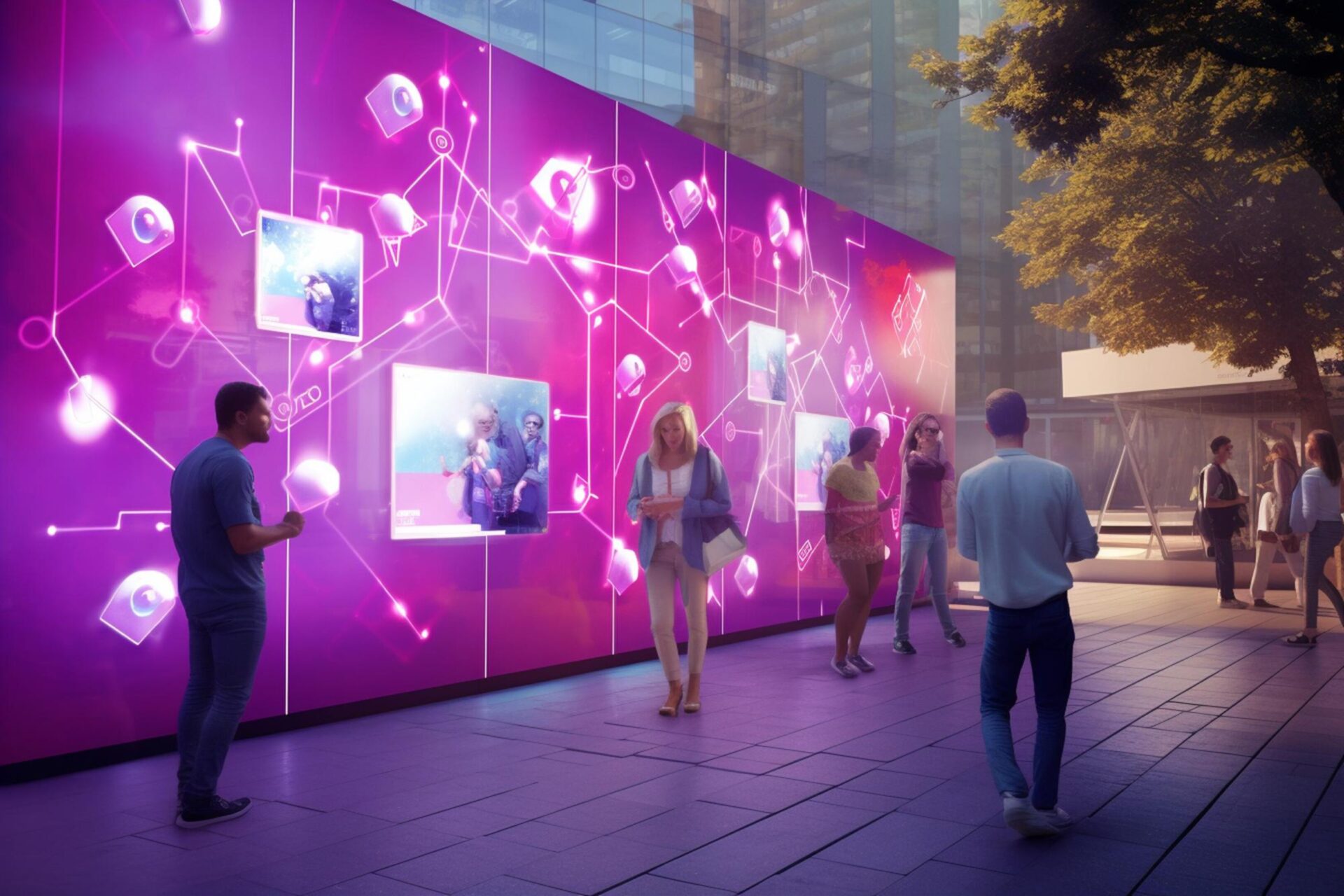
Storytelling is a powerful tool in digital signage design. It allows you to create a narrative that engages your audience, making your content more memorable and impactful. Here’s how you can use storytelling in your design:
- Start with a Clear Message: Every good story has a clear message. Determine what message you want to convey through your digital signage and make sure it’s clear and concise.
- Create a Narrative Flow: Just like a story, your signage content should have a beginning, middle, and end. This could be a progression of images, a sequence of text, or a combination of both.
- Use Visuals to Enhance Your Story: Visuals can greatly enhance your story. Use images, videos, and animations to bring your story to life. Remember, your visuals should support and enhance your message, not distract from it.
- Make it Personal: Personal stories are more engaging and relatable. Consider using user-generated content, such as customer testimonials or social media posts, to make your story more personal.
- Keep it Dynamic: Keep your story dynamic and changing. This could mean updating your content regularly, using dynamic signage content, or incorporating real-time data such as social media feeds or news updates.
13. Use Compelling Call To Action

The Call to Action (CTA) is a crucial component of digital signage, serving as the key prompt that guides viewers toward your desired response. To maximize its effectiveness, it’s essential to employ strategic design and positioning.
Here are several strategies to make your CTAs not only stand out but also drive engagement and conversions:
- Use Contrasting Colors and Bold Fonts:
- Visibility and Attention: Opt for contrasting colors to make your CTA immediately eye-catching. Bold fonts can further enhance visibility, ensuring that the message is clear even from a distance. For instance, a bright color like yellow on a dark blue background can be very effective.
- Clear and Concise Messaging:
- Simplicity is Key: Keep the language of your CTA clear and concise. Viewers should understand exactly what action they’re being asked to take with just a glance. Phrases like “Learn More” or “Join Us Today” directly convey the action and its immediacy.
- Strategic Placement:
- Enhance Impact: Place your CTA in a prominent position on the screen where viewers are naturally drawn to look. This is often towards the center or aligned according to the ‘Z’ or ‘F’ pattern that eyes typically follow when scanning content.
- Create Urgency:
- Encourage Immediate Action: Incorporate a sense of urgency into your CTA. Terms like “Act Now,” “Limited Time Offer,” or “While Supplies Last” can motivate viewers to act immediately. This tactic is particularly effective in promotional or sales-driven contexts, where immediate action is beneficial.
- Test and Refine:
- Continuous Improvement: Regularly test different versions of your CTA in terms of wording, color, size, and placement to find the most effective combination. Use viewer feedback and engagement metrics to refine and perfect your approach.
A well-crafted CTA not only attracts attention but also encourages viewers to engage directly with your content, significantly enhancing the impact of your digital signage campaigns.
Bonus: Keep it Simple
Possibly the most important rule of digital signage design is to ultimately keep it simple. Remember, people need to digest the content you are displaying within seconds as they pass by. So, your design needs to be simple but pack a punch.
Here are some tips to achieve simplicity:
- Clear Message: Keep your message concise and to the point. Avoid using jargon or complex language.
- Minimalist Design: Use a clean, minimalist design. Avoid cluttering your signage with too many elements.
- Consistent Fonts and Colors: Use a consistent font and color scheme throughout your signage. This not only makes your signage look professional but also makes it easier to read.
- Use of White Space: Don’t be afraid to use white space in your design. It can help to highlight key information and make your signage more readable.
- Relevant Content: Only include content that is relevant to your audience and your message. Irrelevant content can distract from your main message and make your signage look cluttered.
- Appropriate Imagery: Use images sparingly and ensure they are relevant to your message. Too many images can make your signage look cluttered and confusing.
Start Creating Unforgettable Digital Signage Designs
The future of digital signage lies in creating dynamic, interactive, and data-driven content that captivates and engages audiences. Emphasizing simplicity and clarity, while incorporating storytelling and high-quality assets, can significantly enhance the user experience.
Designing for accessibility ensures inclusivity, and maintaining brand consistency strengthens identity and trust. The strategic use of motion and quality screens can attract attention without overwhelming viewers.
Key takeaways:
- Use updatable, engaging displays that integrate social media and high-quality visuals for dynamic content.
- Employ touchscreens and QR codes for interactive, personalized user experiences.
- Automatically update signage based on real-time data to keep content relevant.
- Ensure signage is accessible with clear fonts, appropriate colors, audio descriptions, and adherence to ADA and WCAG standards.
- Choose optimal placements and hardware for different lighting conditions and weather.
- Align all signage elements with your brand identity to reinforce recognition and trust.
- Balance dynamic and static elements to maintain viewer interest without distraction.
- Select top-quality screens for clear and vibrant content display.
- Continuously refine content based on feedback and performance metrics.
- Plan a diverse content mix that aligns with viewer habits and preferences.
- Use the highest-resolution images and videos, with legible fonts and professional graphics.
- Use narrative elements to make content compelling and memorable.
- Design calls to action that are visually distinct and strategically placed to prompt interaction.
- Opt for a minimalist design that communicates messages quickly and effectively.
The bottom line is that effective digital signage design is about understanding and connecting with the audience, delivering valuable content, and fostering memorable interactions. Make the process easier and more efficient with the best digital signage solution out there: CrownTV. Get a demo today!

