Have you ever walked past a university entrance and felt lost, uninspired, or confused? You’re not alone. Many institutions underestimate the power of effective entrance signage. It’s not just about slapping a logo on a board or posting directions. It’s about creating a welcoming experience that resonates and guides effortlessly.
Did you know that 55% of people base their first impressions on visual cues? University entrances are no exception. The right signage can set the tone for new visitors, students, and staff, ensuring they feel informed, comfortable, and ready to engage.
Think your entrance signage is doing the job? Think again. Many institutions miss the mark, losing potential connections, engagement, and even enrollment. But don’t worry — you’re in the right place to change that.
In this article, we’ll break down 8 essential tips to transform your university entrance signage into a compelling first impression that truly lasts. Here’s what we’ll cover:
- How to design for maximum visibility and impact.
- Using digital signage to engage and inform at a glance.
- Leveraging color and contrast to direct attention.
- Choosing the right content to display — and when.
- Ensuring accessibility for all with inclusive designs.
- Integrating wayfinding for easy navigation.
- Utilizing technology and innovation to stay ahead.
- Maintaining and updating signage for continued relevance.
By the end, you’ll have all the tools to turn your entrance into a powerful welcome that leaves everyone impressed and informed from the moment they step through your doors. Let’s get started.
Design for Maximum Visibility and Impact
Your university entrance signage is more than just a sign. It’s the first step to capturing attention, conveying information, and setting the stage for every experience that follows. However, achieving maximum visibility and impact requires more than a flashy design. It’s about aligning key elements to ensure your signage gets noticed and remembered.
- Position and Placement Matter: Where you place your signage can make or break its effectiveness. High-traffic areas like entrances, pathways, and waiting zones are prime spots. The goal? Position signs at eye level where they’re most likely to be seen and read quickly. Studies show that signs positioned at a height of 5-7 feet attract relatively more attention than those placed lower or higher.
- Focus on Font and Size: Fonts that are too small or overly decorative can hinder readability. Stick to sans-serif fonts like Arial or Helvetica for clarity. Make sure the font size is large enough to be legible from a distance. A good rule of thumb: every inch of letter height should be readable from up to 10 feet away. So, for a sign that’s meant to be read from 50 feet, letters should be at least 5 inches tall.
- Contrast is Key: Contrast is a critical element in ensuring your signage stands out. Use contrasting colors like the dark text on a light background (or vice versa) to make the content pop. According to a study, high-contrast signs are 47% more legible than those with lower contrast levels, especially in bright outdoor environments.
- Utilize Lighting Effectively: Natural lighting conditions vary, and relying on daylight alone can mean your signs get lost in the shadows or under harsh glares. Consider backlighting or using LED lights to illuminate signs, making them visible at all hours. Ensure that lighting is bright but not overpowering — the aim is to enhance readability, not blind passersby.
- Keep It Simple and Direct: People process visual information in milliseconds. Keep your messaging straightforward and concise. Avoid clutter by sticking to one clear message per sign. Remember, less is often more when it comes to impactful signage.
Designing for maximum visibility and impact is about creating a visual experience that captures attention and delivers information seamlessly. Follow these guidelines, and your entrance signage won’t just be seen — it will be remembered.
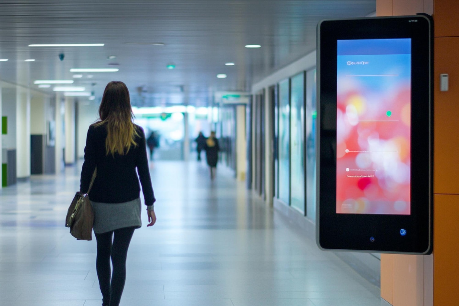
Using Digital Signage to Engage and Inform at a Glance
Digital signage is revolutionizing how universities communicate at their entrances. It’s not just a replacement for static signs — it’s a dynamic tool that grabs attention and conveys information instantly. With the right strategy, digital signage can do much more than inform; it can engage, guide, and even inspire those who pass by.
- Make Content Dynamic and Relevant: Unlike traditional signs, digital displays allow you to change the content in real time. This flexibility means you can share up-to-date information, from event announcements to emergency alerts. A study found that digital signs capture 400% more views than static signs. The reason? Dynamic content keeps things fresh and engaging, encouraging viewers to look each time they pass by.
- Use Visuals to Tell a Story: Digital signage provides a canvas for creativity. Use vibrant visuals, videos, and graphics to convey your message. Visual storytelling is especially powerful in capturing attention — research shows that people remember 80% of what they see, but only 20% of what they read. For instance, a quick video tour of the campus or highlights of upcoming events can immediately resonate with your audience, whether they are current students or new visitors meeting an admissions officer for the first time.
- Incorporate Real-Time Data: Integrate real-time data to provide valuable, actionable information. Display live news feeds, weather updates, social media posts, or countdowns to important university events. For community colleges or universities, providing relevant content tailored to the moment keeps viewers informed and engaged without overwhelming them with static, outdated information.
- Focus on Interactivity: Interactivity is key to keeping people engaged. Consider adding touchscreens or QR codes that invite users to explore more, whether it’s signing up for a newsletter, checking out the campus map, or participating in a survey. Interactive digital signage grabs attention and fosters a deeper connection by encouraging viewers to engage directly with the content. Observing body language and engagement levels can help in refining content strategies for greater impact.
- Optimize for Quick Reads: With digital signage, you have just a few seconds to make an impact. Keep your messages short and to the point. Use bullet points, bold text, and high-impact visuals to ensure your content is easily digestible. Highlight critical information like directions, event times, or calls to action in a way that’s impossible to miss. This approach can also support effective communication of key messages, such as instructions on how to write a compelling personal statement for university applications.
Digital signage isn’t just about broadcasting information; it’s about creating an experience that connects with your audience in seconds. When used strategically, digital displays can elevate your entrance, making it a hub of engagement and information that leaves a lasting impression while contributing to improved learning outcomes.
Leveraging Color and Contrast to Direct Attention
Color isn’t just decoration — it’s a powerful tool that can guide the eye, evoke emotions, and communicate messages instantly. When used correctly, color and contrast become essential components of effective university entrance signage, steering attention exactly where it needs to go. This is particularly true in high-traffic areas like the Financial Aid Office or the admissions office, where clarity is essential to direct and assist college students effectively.
- Understand the Psychology of Color: Colors have specific meanings and can influence behavior. For instance, blue often conveys trust and calm, making it ideal for directions or informational signs. Red, on the other hand, signals urgency and can be used effectively for alerts or important announcements. Choosing the right color can set the tone and ensure your message is perceived in the intended way. Effective use of color can promote positive student interactions by creating a welcoming environment that fosters engagement and support.
- Contrast Creates Clarity: Strong contrast between text and background is crucial for readability. For outdoor digital signage, consider high-contrast combinations like white text on a dark background or vice versa. This sharp differentiation is particularly vital in varying lighting conditions, ensuring that your signs remain visible from a distance and readable at a glance. According to the studies, the contrast increases legibility by up to 30%, which is critical in busy environments like university entrances or areas with a high flow of other students.
- Color Hierarchy Enhances Comprehension: A well-defined color hierarchy helps prioritize information. Use one dominant color for the primary message and a secondary color for supporting details. For example, use bold, warm colors like red or orange to highlight urgent messages or key directions, such as pointing new graduate school applicants to relevant departments. Cooler, subdued tones such as greens or blues can be reserved for less critical information, such as campus events or reminders about campus life.
- Complement with Neutral Tones: While vibrant colors catch the eye, balancing them with neutral tones like black, white, or gray can prevent visual overload. Too many bright colors can make a sign appear cluttered and difficult to read. A well-thought-out blend of neutrals and accent colors maintains a clean and professional look while directing focus where it’s needed most. This approach helps maintain a positive attitude and creates a harmonious experience for both new and returning members of the college community.
- Testing and Adjusting for Optimal Impact: Not all color choices work the same in every setting. Test different color and contrast combinations under various lighting conditions and at different times of the day. Pay attention to feedback from your audience — what grabs their attention? What gets missed? This data-driven approach will help you fine-tune your color strategy for maximum effectiveness, contributing to improved test scores and overall student success by providing a visually supportive environment.
By understanding and implementing the right color strategies, your university entrance signage can significantly enhance communication, guide college students and visitors effectively, and support the overarching goals of your institution.
Choosing the Right Content to Display — and When
Content on your university entrance signage should do more than just inform — it should connect, captivate, and convert. Selecting the right content is essential, but so is knowing when to display it. A carefully curated mix of information, timed for maximum impact, can transform your digital signage into a powerful communication tool.
- Prioritize Content Based on Audience Needs: Think about who’s viewing your signage and what they need at any given moment. During the morning rush, display content that assists with navigation — maps, building locations, and event schedules. In the late afternoon, shift to announcements about upcoming activities, seminars, or deadlines. Content should always align with the current needs of your audience to ensure relevance.
- Schedule High-Engagement Content Strategically: Certain content types draw more attention than others. Leverage these to your advantage by scheduling them at peak times. For example, highlight student achievements or showcase vibrant event photos during lunchtime, when foot traffic is high. This celebrates the community and reinforces a positive image to all who pass by.
- Rotate Messages to Keep Eyes on the Screen: Stale content leads to disengagement. To maintain interest, keep a rotation schedule that updates content regularly. Aim for a mix of static messages, animations, and videos. This variety can help retain attention longer and ensure repeat viewers encounter fresh information.
- Use Call-to-Actions Sparingly But Effectively: A well-placed call-to-action (CTA) can drive immediate engagement, but overuse can dilute its power. Selectively display CTAs during times when action is most likely, such as during registration periods or before key deadlines. Encourage viewers to scan a QR code, visit a website, or sign up for events — but make sure every CTA is purposeful and not overwhelming.
- Align Content with Institutional Goals: Align the content with broader university objectives, such as promoting upcoming events, highlighting academic achievements, or reinforcing brand identity. Incorporate a mix of evergreen content (like mission statements) and timely updates (like emergency alerts) to maintain balance and keep the audience informed and engaged with your institution’s core values.
- Monitor Performance and Adjust Accordingly: Data is your ally. Use analytics tools to monitor which types of content receive the most attention or drive the most action. Adjust the content schedule based on these insights to continuously improve the effectiveness of your signage strategy. For example, if announcements about sports events gain higher engagement than seminar notices, consider allocating more screen time to such content.
Selecting the right content and timing it correctly can turn your entrance signage from a basic information board into a dynamic platform that engages, informs, and drives action — all while reflecting the vibrancy and purpose of your institution.
Ensuring Accessibility for All with Inclusive Designs
Accessibility isn’t just a buzzword; it’s a fundamental aspect of designing effective university entrance signage. When signage is inclusive, it ensures everyone — regardless of ability — can access information quickly and easily. Failing to account for diverse needs can exclude significant portions of your audience, making it harder for them to navigate and engage with your campus.
To begin, consider readability. High-contrast text and background combinations are essential, particularly for those with visual impairments. Avoid overly decorative fonts that can be challenging to read. Instead, use simple, clear typefaces, and ensure the text size is large enough to be seen from a distance. Signs should be viewable from both standing and seated positions, accommodating people of varying heights and those using wheelchairs.
Another key component is incorporating multiple modes of communication. For example, pairing text with symbols or pictograms can bridge language barriers and aid individuals with cognitive disabilities. Tactile elements like braille should be present on all essential signs, ensuring those who are visually impaired can navigate the space independently. Voice-activated features or touch-responsive digital displays can also add an extra layer of inclusivity, providing an accessible option for everyone.
Placement matters, too. Signs should be positioned at appropriate heights, considering both wheelchair users and standing viewers. They should also be located in well-lit areas, free of obstructions, to allow for easy viewing. Consider the pathways leading up to and around the signage; are they wide enough, smooth, and free of tripping hazards?
Accessibility is also about clarity of information. Simple, straightforward language minimizes confusion, especially for non-native speakers or those with cognitive challenges. Icons, color coding, and clear directions should complement the written text, providing multiple ways for users to access the information they need. Inclusive design goes beyond just meeting minimum standards or checking off boxes. It’s about creating an environment where everyone feels welcome and empowered to navigate the campus confidently. By ensuring your signage is accessible to all, you’re not just complying with regulations — you’re fostering a more inclusive and engaging experience for every visitor.
Integrating Wayfinding for Easy Navigation
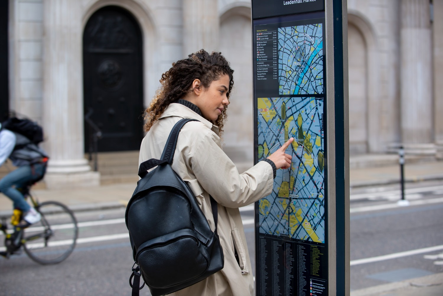
Picture this: stepping onto a university campus for the first time. Sprawling buildings. Intersecting pathways. Countless destinations. Feeling overwhelmed is almost inevitable. This is where effective wayfinding steps in — acting as a silent guide that leads visitors through unfamiliar terrain with confidence and ease.
Wayfinding functions like an invisible network that connects every corner of your campus. It starts at the entrance, where clear, concise directional signs instantly orient visitors, directing them to key locations such as:
- Administration offices
- Lecture halls
- Libraries
- Parking lots
These initial cues should be strategically placed to intercept foot traffic, ensuring no one wanders aimlessly or gets lost.
Consistency is key. Use standardized symbols, fonts, and color schemes across all signage to establish a visual language that’s easily understood at a glance. This helps:
- Reduce decision-making time
- Enhance overall navigability by building trust in the familiar cues provided by your signs.
To take wayfinding to the next level, integrate digital maps and directories that update in real-time. These tools are invaluable in dynamic environments where events, classes, or construction projects frequently change the layout. Position digital directories at key junctions — like building entrances or major walkways — to act as navigational checkpoints where visitors can quickly reorient themselves.
Layer your wayfinding strategy with a mix of macro and micro signage:
- Macro signs: Large overhead directional boards that guide people to major campus zones.
- Micro signs: Door plaques or small directional arrows providing detailed guidance to specific rooms or facilities.
And don’t forget to consider the flow of pedestrian traffic. Identify where congestion builds up and place wayfinding signs to reduce confusion at these critical points. Keep pathways clear and position signs well in advance of decision points, giving users time to process and choose the correct route.
Integrating wayfinding into your university entrance signage is about more than just directing traffic. It’s about creating a seamless, intuitive experience that showcases your institution’s commitment to accessibility and hospitality. A well-crafted wayfinding system — clear, consistent, and comprehensive — empowers every visitor to navigate your campus with ease and assurance.
Utilizing Technology and Innovation to Stay Ahead
In today’s fast-paced environment, universities must leverage technology to stay ahead. A tech-forward approach to entrance signage does more than catch the eye; it creates a dynamic, memorable experience that sets your institution apart. The right tools and innovations can elevate your university’s first impression, making it both engaging and efficient.
Enter CrownTV’s digital signage media player — a true game-changer for university entrances. This compact yet powerful device enables:
- Smooth, high-definition content delivery
- Captivating visual experiences that grab attention instantly
- Seamless broadcasting of welcome messages, real-time event updates, or emergency alerts across all screens
But innovation isn’t just about hardware. It’s about managing and delivering content efficiently. This is where CrownTV’s cloud-based digital signage software comes into play:
- Control and update entrance signage in real time from anywhere
- Effortlessly manage multiple displays across different buildings
- Adjust messages, schedule content, and integrate social media feeds or live news updates — all from one intuitive dashboard
This technology allows you to maintain a cohesive, responsive communication strategy that keeps your audience informed and engaged. Beyond mere information broadcasting, use digital signage to personalize the entrance experience. CrownTV’s dashboard enables tailoring of content based on:
- Specific events (e.g., open houses or student orientation)
- Times of day
- Audience segments
Picture highlighting key campus areas, sharing student testimonials, or displaying interactive maps — all of which make visitors feel instantly connected to your university.
And there’s more. CrownTV’s solutions extend to digital signage implementation services tailored specifically for university environments:
- Selection of the right display hardware
- Professional installation and ongoing technical support
- Expert advice on optimal screen placement to maximize visibility and engagement
By integrating CrownTV’s digital signage solutions, universities can stay at the cutting edge of technological advancements, ensuring their entrance experience is not only visually striking but also highly functional. This is about making a lasting impression — one that reflects your institution’s dedication to innovation, communication, and excellence from the moment someone steps onto your campus.
Maintaining and Updating Signage for Continued Relevance
University entrance signage is not a “set it and forget it” component. For signage to remain effective, it must stay relevant — consistently reflecting current information and the evolving needs of your institution. Here’s how to ensure your entrance signage never becomes stale or outdated:
- Regular Audits: Conduct periodic reviews of all entrance signage to identify any outdated information or wear and tear. Schedule these audits at least once per semester or whenever significant changes occur on campus. Keep a checklist handy to evaluate content accuracy, readability, and overall condition.
- Seasonal and Event-Based Updates: Align your signage content with the academic calendar and campus events. Whether it’s welcoming new students at the start of a semester, promoting upcoming lectures, or providing information about holiday closures, ensure the displayed content is timely and pertinent to your audience.
- Leverage Feedback: Engage with students, staff, and visitors to gather feedback on the effectiveness of your signage. Use surveys, suggestion boxes, or even quick polls to understand what’s working and what needs improvement. Direct input from your audience can reveal insights that you might have overlooked.
- Monitor for Wear and Tear: Exposure to weather, sunlight, and everyday use can degrade the appearance and functionality of your signage. Inspect both digital and traditional signs for any fading, damage, or malfunctioning elements. Replace or repair as needed to maintain a clean, professional appearance.
- Use Data Analytics: For digital signage, leverage analytics tools to track which content receives the most engagement. Identify patterns and adjust content accordingly — focus on what captures attention and discard what doesn’t. This data-driven approach keeps your signage relevant and engaging.
- Content Refreshes: Regularly update visual elements, such as images, colors, and fonts, to keep the signage visually appealing. Even minor changes can make a significant impact in refreshing the look and feel of your signs and sustaining viewer interest.
- Emergency Preparedness: Have a plan in place for quickly updating signage in case of emergencies, such as severe weather, campus closures, or other unexpected events. This readiness ensures that your signage remains a reliable source of current information, no matter the circumstances.
Maintaining and updating your university entrance signage requires a proactive approach. By staying vigilant and responsive to changes, you ensure that your signage continues to serve its purpose effectively — communicating the right message at the right time to everyone who walks through your doors.
Conclusive Thoughts: Crafting a Lasting First Impression with Smart Signage
Optimizing your university entrance signage is not just about aesthetics; it’s about creating a meaningful experience for every visitor, student, and staff member who steps onto your campus. By focusing on design, technology, accessibility, and regular updates, you’re setting the stage for a positive first impression that reflects your institution’s values and commitment to excellence.
Let’s quickly recap the essential tips that can help transform your entrance signage into a powerful communication tool:
- Design for maximum visibility and impact to ensure every sign stands out and captures attention.
- Utilize digital signage to engage and inform your audience at a glance.
- Leverage color and contrast strategically to direct focus and enhance comprehension.
- Choose the right content to display and schedule it effectively for maximum relevance.
- Ensure accessibility with inclusive designs that welcome everyone.
- Integrate wayfinding solutions that simplify navigation and create a seamless campus experience.
- Adopt the latest technology and innovative solutions to stay ahead of the curve.
- Maintain and update signage regularly to keep it fresh, engaging, and aligned with your university’s goals.
Implementing these strategies can make your university entrance a vibrant and welcoming gateway, reinforcing your brand and leaving a lasting impression. Remember, the entrance is the first touchpoint — make it count. With thoughtful planning and execution, your signage can become a dynamic part of the campus experience, setting the tone for all that your institution has to offer.