CrownTV blog
Digital signage, in practice.
Field-tested guidance on digital signage hardware, software, content, and rollouts from the CrownTV team — 13 years and 10,000+ screens deployed.
No articles match that search. Try a different keyword or clear the filters.
-
 Digital Signage 5 min read
World Cup 2026 Promotion Ideas for Bars & Restaurants: 15 Plays That Fill Seats
15 World Cup 2026 promotion ideas for bars and restaurants — fixture boards, happy-hour flips, halftime promos, final-day packages, and the screens that run them.
Alex Taylor Jun 12, 2026 -
 Digital Signage 9 min read
Sports Bar TV Setup for World Cup 2026: The Complete Screen Playbook
World Cup 2026 is live through July 19. The sports bar TV setup playbook: how many TVs you need, commercial vs consumer panels, layout, signage, and cost.
Alex Taylor Jun 11, 2026 -
 Retail 6 min read
Behind the Janie and Jack rollout: a multi-year retail signage program now live in five cities
Janie and Jack × CrownTV × Samsung — five stores live (NYC, NJ, Austin, London, Milan) running 4K commercial signage. Inside the rollout, hardware, playbook.
Jacob L 2026-05-04T11:00:00Z -
 Digital Signage 16 min read
Best TVs for Digital Signage (2026): 10 Commercial Displays Ranked After 13,500+ Deployments
Best TVs for digital signage in 2026 — Samsung QM, OM, LG UH5N-E, Sony BZ40L and 6 more, ranked by nits, duty cycle, OS, warranty and real-world fit.
Jacob L Mar 15, 2026 -
 Digital Signage 11 min read
Samsung UH55F-E: Complete Guide to Samsung's 55" Ultra Narrow Bezel Video Wall Display
Samsung UH55F-E review from a 10,000-screen operator: bezel, brightness, duty cycle, specs, real installs, and video wall fit.
Alex T Mar 13, 2026 -
 Digital Signage 11 min read
Samsung UM55H-E: Complete Guide to Samsung's 55" Ultra Narrow Bezel Video Wall Display
Samsung UM55H-E review: 55" FHD video wall with 1.7mm bezel, 500 nits, 24/7 rated. Specs, install tips, pricing, and comparisons to the UH55F-E and VH55T-E.
Ben Parker Mar 13, 2026 -
 Digital Signage 10 min read
Samsung VH55T-E: The Complete Guide to Samsung's Premium 55" Video Wall Display
Samsung VH55T-E review: ultra-narrow bezel video wall display for broadcast, lobbies, and luxury retail, with specs and install notes.
Alex T Mar 13, 2026 -
 Digital Signage 11 min read
Best Samsung Commercial Display Resellers in the US (2026)
Best Samsung commercial display resellers in the US for 2026: 7 authorized partners compared on pricing, install, CMS, warranty, and multi-location support.
Alex T Mar 11, 2026 -
![Digital Menu Boards: The Complete Guide for Restaurants [Cost, Design & Setup 2026]](/blog-images/2025/12/IMG_9457-scaled.jpeg) Digital Signage 8 min read
Digital Signage 8 min readDigital Menu Boards: The Complete Guide for Restaurants [Cost, Design & Setup 2026]
Digital menu boards in 2026: real costs, design rules, setup steps, and the mistakes restaurants keep making — drawn from hundreds of CrownTV installs.
Alex Taylor Feb 23, 2026 -
 Digital Signage 16 min read
Samsung QM43C: Specs, Install & Use Cases for the 43-Inch 4K Commercial Display
Samsung QM43C guide — 43-inch commercial display specs, install guidance, comparisons, and real CrownTV deployment notes.
Alex T Dec 25, 2025 -
 Digital Signage 9 min read
Samsung QM50C: Complete Guide to the 50-inch 4K Commercial Display (2026 Buyer's Guide)
Samsung QM50C buyer's guide — 50-inch 4K, 500 nits, 24/7-rated, Tizen + MagicINFO. Practical install notes from real CrownTV deployments.
Alex T Dec 25, 2025 -
 Digital Signage 14 min read
Samsung QM55C: Complete Guide to the 55-inch 4K Commercial Display (2026 Buyer's Guide)
Samsung QM55C buyer's guide — 55-inch 4K, 500 nits, 24/7-rated, Tizen + MagicINFO. Real install notes from 10,000+ deployed CrownTV screens.
Alex T Dec 25, 2025 -
 Digital Signage 9 min read
Samsung QM65C: Complete Guide to the 65-inch 4K Commercial Display (2026 Buyer's Guide)
Samsung QM65C buyer's guide — 65-inch 4K, 500 nits, 24/7-rated, Tizen 7.0 + MagicINFO. Real install notes from 10,000+ CrownTV deployments.
Alex T Dec 25, 2025 -
 Digital Signage 11 min read
Samsung QM75C: Complete Guide to the 75-inch 4K Commercial Display (2026 Buyer's Guide)
Samsung QM75C buyer's guide — 75-inch 4K, 500 nits, 24/7-rated, Tizen 7.0 + MagicINFO. Real install notes from CrownTV's deployed fleet.
Ben Parker Dec 25, 2025 -
 Digital Signage 10 min read
Samsung QM85C: Complete Guide to the 85-inch 4K Commercial Display (2026 Buyer's Guide)
Samsung QM85C buyer's guide — 85-inch 4K, 500 nits, 24/7-rated, Tizen 7.0 + MagicINFO. Real install notes from CrownTV's flagship deployments.
Alex T Dec 25, 2025 -
 Digital Signage 10 min read
Top 10 Samsung Commercial Displays for Enterprise Digital Signage (2026)
10 Samsung commercial display series ranked for enterprise: real specs, pricing context, and where each display type fits.
Alex T Sep 9, 2025 -
 Digital Signage 5 min read
Retail Window Displays That Stop Foot Traffic: 2026 Ideas & Examples
Retail window displays that actually stop foot traffic — Samsung OM panels, motion content, scheduling rules, plus seven plays that work in 2026.
Estelle B Jun 5, 2025 -
 Digital Signage 10 min read
Samsung QMC Displays Explained: Which Size Is Right for Your Business?
Operator guide to Samsung QMC displays: sizes, specs, install advice, pricing context, and how to pick the right commercial display.
Alex T Apr 15, 2025 -
 Digital Signage 8 min read
Cheap Digital Signage: What Actually Goes Wrong, and What It Costs to Fix
Cheap digital signage costs more long-term — failure rates, warranty gaps, and the hardware-software-install combinations that fail in the field.
April Restrivera Apr 12, 2025 -
 Digital Signage 13 min read
Where to Buy Samsung QMC Displays in the U.S. Without Overpaying
Where to buy Samsung QMC displays in the U.S. without overpaying: authorized channels compared, real pricing, warranty rules, and how to bundle install and CMS.
Ben Parker Apr 10, 2025 -
 Digital Signage 10 min read
Samsung QMC Series: The Best Indoor Digital Signage Display for 2026?
Samsung QMC series 2026 overview — slim 4K 24/7 commercial displays. QM32C through QM98C, real install notes, and where the QMC wins.
Ben Parker Apr 3, 2025 -
 Digital Signage 11 min read
Samsung QMC vs QBR vs QMR: How to Pick the Right Commercial Display Series (2026)
QMC = slim 28.5mm 24/7 500-nit premium. QBR = 16/7 350-nit budget. QMR = 24/7 500-700 nit rugged. Spec table, pricing, and which to pick.
Alex T Apr 1, 2025 -
 Digital Signage 13 min read
How to Install and Optimize a Samsung QMC Display (Complete 2026 Guide)
How to install and optimize a Samsung QMC commercial display — mounting, power, network, brightness, calibration, and content. From 10,000+ CrownTV deployments.
Alex T Mar 31, 2025 -
 Digital Signage 6 min read
Digital Signage Software: Features That Actually Matter in 2026
Real features that matter in digital signage software: remote management, scheduling, uptime monitoring. From an operator running 10,000 screens.
Alex T Mar 28, 2025 -
 Digital Signage 13 min read
Digital Donor Walls: Recognition Walls That Donors Actually Stop For
Digital donor wall buyer's guide — three donor recognition wall configurations (single panel, video wall, interactive), hardware, software, and honest installed pricing.
Alex T Mar 9, 2025 -
 Digital Signage 4 min read
Digital Lobby Signage: What to Install and How It Pays Back
Digital lobby signage hardware, software, and content rules — drawn from corporate, hospitality, and healthcare lobbies running across 1,800+ operators.
Alex T Feb 28, 2025 -
 Digital Signage 3 min read
Turnkey Digital Signage: What 'Done-for-You' Actually Buys You
What turnkey digital signage actually includes — hardware, software, install, content, and service under one contract. With real cost ranges and timeline.
Alex T Feb 6, 2025 -
 Digital Signage 4 min read
Brown Bag Presentations That Actually Build Teams
A practical guide to brown-bag presentations — format, topics that actually work, common failure modes, and how to fill the room.
Alex T Jan 30, 2025 -
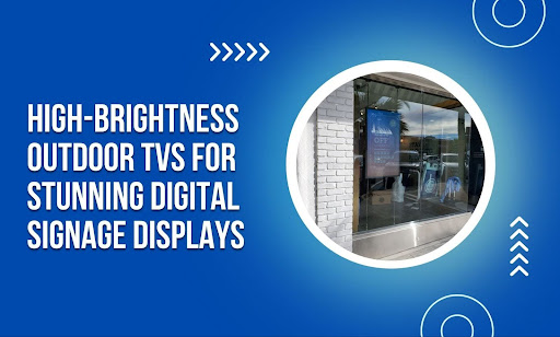 Digital Signage 6 min read
High-Brightness Outdoor TVs for Digital Signage: A Practical Guide
Outdoor digital signage needs 2,500+ nits to beat sunlight. Real specs, sealed enclosures, drive-thru and storefront examples from a 13-year operator.
Alex T Dec 18, 2024 -
 Digital Signage 11 min read
ScreenCloud vs OptiSigns vs Yodeck: 3-Way Comparison of Top Digital Signage CMS in 2026
ScreenCloud ($20) vs OptiSigns ($10) vs Yodeck ($8) in 2026 — pricing, hardware, apps, free tier, and where each wins. From a 13-year deployment partner.
Alex Taylor Nov 22, 2024 -
 Digital Signage 10 min read
What Is Samsung Tizen for Digital Signage? An Operator's Guide
Samsung Tizen explained for digital signage: what it is, what it does well, where it falls short, and how to pair it with a real CMS for multi-screen fleets.
Ben Parker Nov 18, 2024 -
 Digital Signage 6 min read
Hospitality Apps That Actually Move the Needle: A 2026 Operator's Guide
Six hospitality apps that change unit economics — guest messaging, in-room engagement, booking, signage. What each one solves, and where it fits.
Alex T Nov 15, 2024 -
 Digital Signage 4 min read
Medical Spa Marketing Ideas That Actually Book Appointments
Medical spa marketing tactics that fill the schedule — local SEO, before/afters, the waiting-room loop, referral loops, and what to track to know it's working.
Alex T Nov 9, 2024 -
 Digital Signage 5 min read
Hospital Waiting Room Design: Practical Ideas That Reduce Anxiety
Hospital waiting rooms shape patient satisfaction more than most operators realize. Practical design, signage, and operational ideas that make a difference.
Alex T Nov 8, 2024 -
 Digital Signage 9 min read
Samsung The Wall All-in-One 146-Inch MicroLED: Buyer's Guide for Marquee Installations
Samsung The Wall All-in-One 146" MicroLED — full review, install considerations, and how it fits into flagship retail, corporate, and hospitality installs.
Ben Parker Nov 8, 2024 -
 Digital Signage 6 min read
Digital Signage vs Static Signage in 2026: When Each Wins, When the ROI Breaks
Digital signage vs static printed signage — cost, content flexibility, ROI breakeven, scenarios where each wins. Honest math from a 13-year operator.
Alex Taylor Nov 4, 2024 -
 Digital Signage 8 min read
Conference Room Displays: The 5 Meeting Room Display Solutions That Actually Work
Conference room displays compared — 5 meeting room display solutions for 2026: commercial 4K + Teams/Zoom Rooms compute, video bars, interactive touch, dual-display boardrooms, and room scheduling panels.
Alex T Oct 20, 2024 -
 Digital Signage 2 min read
Scrolling Ticker Tape Displays: When They Work, and How to Build One
Scrolling ticker displays — where they work (newsrooms, lobbies, brokerages), where they don't, and how to build one with real hardware and software specs.
Alex T Oct 14, 2024 -
 Digital Signage 12 min read
Samsung vs LG Digital Signage in 2026: Honest Head-to-Head from a Samsung Partner Who Ships Both
Samsung vs LG digital signage 2026 — QM vs UH5N, Tizen vs webOS, MagicINFO/VXT vs SuperSign, Knox vs ConnectedCare. Honest verdict from a Samsung partner.
Alex Taylor Oct 8, 2024 -
 Digital Signage 9 min read
Samsung OM55N-DS: The Double-Sided 55-Inch Window Display Buyer's Guide
Samsung OM55N-DS double-sided window display — 3,000 nits per side, slim chassis, ceiling or floor mount. Real install guidance and named CrownTV deployments.
Alex T Oct 4, 2024 -
 Digital Signage 5 min read
Clinic Marketing Strategy: 9 Steps That Actually Fill the Schedule
Nine clinic marketing steps that produce booked appointments — local SEO, reviews, referrals, waiting-room signage, and the loop that ties them together.
Alex T Sep 19, 2024 -
 Digital Signage 14 min read
Samsung OM55B: Specs, Install, and Use Cases for the 55-Inch Window Display
Samsung OM55B (LH55OMBEBGBXZA) — 55-inch, 3,000-nit, 4K UHD window display. Full spec sheet, install guidance, comparisons, and CrownTV deployments.
Alex T Sep 12, 2024 -
 Digital Signage 15 min read
Tizen vs Google TV for Digital Signage: Which OS Should Power Your Screens in 2026?
Tizen vs Google TV for digital signage 2026 — Samsung's commercial Linux OS vs Google's Android platform. Hardware, MagicINFO, Knox, lifecycle compared.
Alex Taylor Sep 12, 2024 -
 Digital Signage 7 min read
Samsung MagicINFO vs ScreenCloud: The 2026 Honest Comparison
Samsung MagicINFO vs ScreenCloud in 2026 — pricing, hardware lock-in, BYOD support, install service, and which CMS wins for which use case.
Alex Taylor Sep 8, 2024 -
 Digital Signage 7 min read
Clinic Marketing Strategy: A Six-Channel Playbook That Actually Fills the Schedule
A practical clinic marketing playbook — local SEO, reviews, referrals, in-clinic signage, reactivation, and paid. What works, what each channel costs.
Alex T Sep 4, 2024 -
 Digital Signage 7 min read
Small Business Guide to Digital Signage: A Practical 2026 Playbook
A 2026 small business digital signage guide: what to buy, what to spend, how to deploy. Real specs, real pricing, no fluff. From an operator with 13+ years.
Alex T Sep 2, 2024 -
 Digital Signage 9 min read
7 Best Digital Poster Designs to Boost Engagement (2026 Guide)
The 7 digital poster design patterns that consistently move engagement — motion, hierarchy, color, contrast, and the hardware that makes them readable.
Alex T Sep 1, 2024 -
 Digital Signage 5 min read
How to Create an Effective Communication Board for Your Workplace
A digital communication board done right replaces stale corkboards and email blasts. Layouts, content cadence, and hardware that actually get read.
Alex T Aug 31, 2024 -
 Digital Signage 4 min read
Communication Board Ideas for Business: 5 That Actually Get Read
Five communication board ideas that employees actually look at — KPI dashboards, recognition feeds, safety incident counters, and two more that work.
Alex T Aug 31, 2024 -
 Digital Signage 10 min read
Commercial TV Buyer's Guide: How to Choose a TV for Business Use (2026)
Commercial TV buyer's guide — how to choose a TV for business use by location, runtime, size, brightness, panel rating, OS, ports, and warranty, plus what a commercial TV costs installed.
Ben Parker Aug 30, 2024 -
 Digital Signage 14 min read
How to Set Up Digital Menu Boards for Your Food Truck
Attract more customers and boost sales with digital menu boards for your food truck. Learn how to set them up and create eye-catching displays that keep.
Ben Parker Aug 28, 2024 -
 Digital Signage 3 min read
Social Media Bulletin Boards — 5 Real Implementations
Five social-media bulletin board patterns — branded hashtag walls, UGC moderation, leaderboards, recognition feeds — with real hardware and content workflows.
Alex T Aug 25, 2024 -
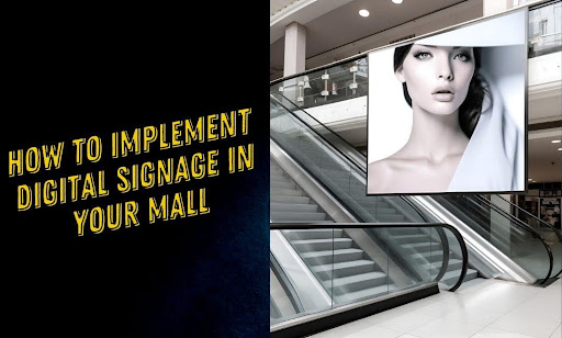 Digital Signage 13 min read
How to Implement Digital Signage in Your Mall
Shopping mall digital signage: wayfinding, retailer promos, and video walls. A practical implementation guide — plus the commercial hardware malls actually need.
Ben Parker Aug 24, 2024 -
 Digital Signage 3 min read
How to Make a Digital Bulletin Board: A Practical Setup Guide
How to set up a digital bulletin board — hardware, software, content, mounting — for offices, schools, churches, and community spaces.
Alex T Aug 23, 2024 -
 Digital Signage 8 min read
5 Steps to Creating an Effective Digital Bulletin Board (2026)
The five-step process for designing digital bulletin board content that gets read — strategy, hardware, content design, scheduling, and CrownTV install proof.
Alex T Aug 23, 2024 -
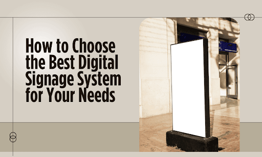 Digital Signage 4 min read
How to Choose a Digital Signage System: A Buyer's Framework
A practical framework for choosing a digital signage system: hardware, software, integration, deployment, and total cost — written from 13+ years of installs.
Alex T Aug 22, 2024 -
 Digital Signage 3 min read
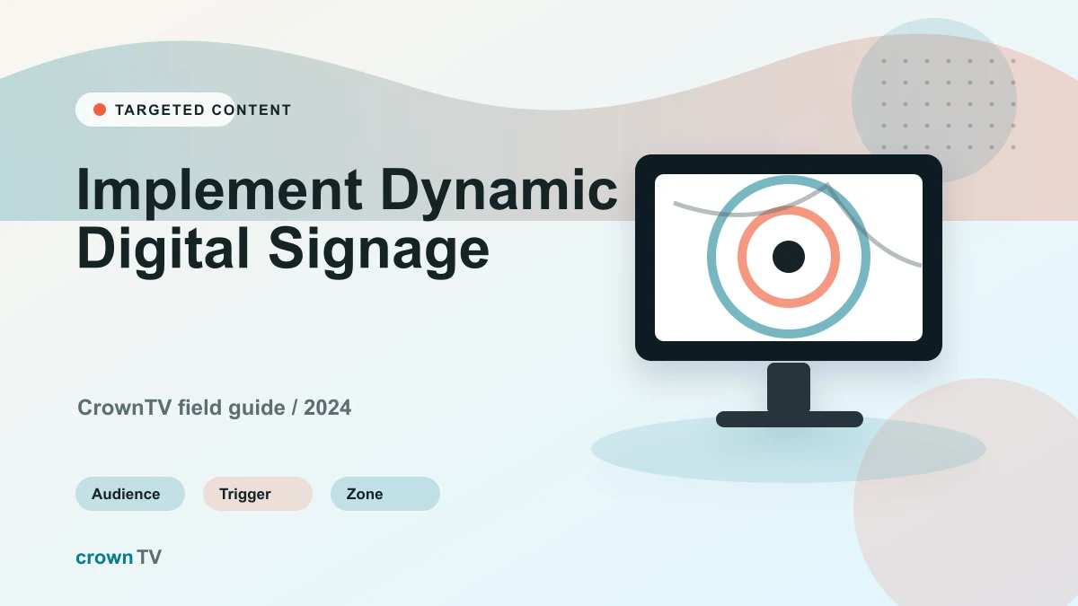
How to Implement Dynamic Digital Signage
Implementing dynamic digital signage — site survey to commissioning, with content workflow and POS integration for multi-location operators.
Alex T Aug 22, 2024 -
 Digital Signage 4 min read
5 Real Benefits of Dynamic Digital Signage (and Two That Are Oversold)
Five benefits of dynamic digital signage backed by 13+ years of deployments — plus two commonly cited benefits that don't hold up in real installs.
Alex T Aug 21, 2024 -
 Digital Signage 4 min read
Top Digital Signage Systems for 2026: A Practical Comparison
The five digital signage system formats worth considering — interactive, video walls, wayfinding, menu boards, and standard signage. What each one costs.
Alex T Aug 21, 2024 -
 Digital Signage 4 min read
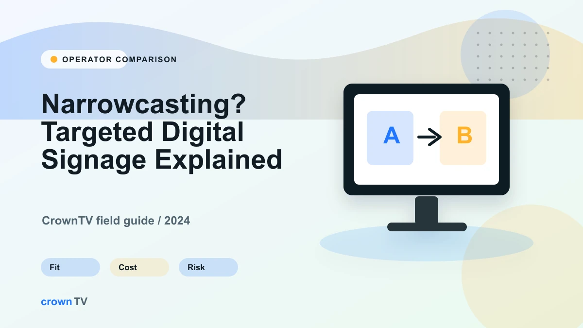
How to Implement Narrowcasting: Audience, Location, and Daypart Rules
Implementation guide for narrowcasting: map screen groups, build CMS rules, wire data sources, test fallback content, and measure deployment performance.
Alex T Aug 20, 2024 -
 Digital Signage 4 min read
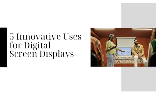
Digital Screen Displays: 5 Use Cases Beyond Advertising
Five working use cases for digital screen displays — retail, healthcare, civic, art, and education — with the hardware and software details behind each.
Alex T Aug 19, 2024 -
 Digital Signage 9 min read
Samsung OM75A: The 75-Inch High-Brightness Window Display Buyer's Guide
Samsung OM75A — 75" 4K, 3,500-nit window display for flagship storefronts. Real specs, install considerations, and named CrownTV deployments.
Alex T Aug 19, 2024 -
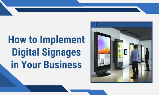 Digital Signage 11 min read
How to Implement Digital Signages in Your Business
Unlock the power of digital signage. Discover how to captivate customers, boost sales, and transform your business with dynamic displays. Learn.
Ben Parker Aug 18, 2024 -
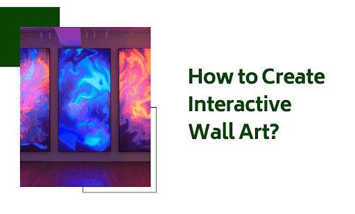 Digital Signage 5 min read
How to Create Interactive Wall Art: Hardware, Software, and Reality
Interactive wall art for retail flagships, lobbies, and museums — touch, motion, projection, video walls. Real hardware and costs.
Alex T Aug 17, 2024 -
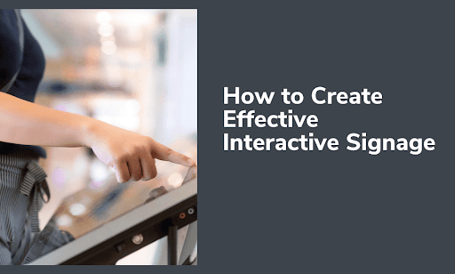 Digital Signage 5 min read
How to Create Effective Interactive Signage: A Practical Guide
Touch kiosks, wayfinding, product finders, and self-service: how to design interactive signage that gets used — hardware, software, and content principles.
Alex T Aug 16, 2024 -
 Digital Signage 12 min read
Best Digital Signage Companies & Manufacturers in 2026: Providers, Displays & Players
Best digital signage companies and manufacturers in 2026 — end-to-end providers vs software-only platforms vs display makers, and how to choose or switch.
Alex T Aug 16, 2024 -
 Digital Signage 9 min read
6 Innovative Uses for Digital Display Boards (2026 Guide)
Six high-impact use cases for digital display boards — wayfinding, retail, internal comms, education, healthcare, hospitality — with real CrownTV install proof.
Alex T Aug 14, 2024 -
 Digital Signage 4 min read
Digital Menu Board Prices: A Line-by-Line Cost Guide
Real digital menu board prices by line item: panels, players, software, install, and content — drawn from QSR and cafe deployments across 1,800+ operators.
April Restrivera Aug 14, 2024 -
 Digital Signage 5 min read
How to Install a Digital Display Board: Step-by-Step Guide
How to spec, mount, and commission a digital display board — sizing, brightness in nits, mounting hardware, cabling, and CMS setup. Real specs, no guesswork.
Alex T Aug 14, 2024 -
 Digital Signage 8 min read
10 Advantages of Using Digital Menus in Your Restaurant (2026)
Ten reasons digital menus outperform print in 2026 — pricing flexibility, dayparting, AOV lift, POS integration, and CrownTV install proof.
Alex T Aug 12, 2024 -
 Digital Signage 8 min read
How to Create Attractive Digital Menu Boards (2026 Restaurant Guide)
How to design digital menu boards that actually drive orders — typography, hierarchy, dayparting, hardware spec, and CrownTV install proof.
Alex T Aug 11, 2024 -
 Digital Signage 9 min read
Narrowcasting Deployment Checklist: 5 Readiness Checks Before Launch
A pre-launch narrowcasting checklist for deployment readiness: hardware fit, content strategy, dayparting, measurement, CMS scale, and common mistakes.
Ben Parker Aug 11, 2024
Archive
More digital signage articles
- Aug 10, 2024 Directory Signage Systems: 5 Options for Large Buildings
- Aug 8, 2024 How to Design and Implement TV Menu Boards (2026 Operator's Guide)
- Aug 8, 2024 TV Menu Board Ideas for Restaurants: 7 Layouts That Drive Orders
- Aug 7, 2024 How to Choose a Digital Signage System for Your Business
- Aug 6, 2024 How to Set Up an Effective Digital Bulletin Board (2026 Step-by-Step Guide)
- Aug 5, 2024 5 Reasons to Implement a Digital Bulletin Board in Your Office (2026 Guide)
- Aug 4, 2024 Why Cloud Digital Signage is the Future of Advertising (2026 Edition)
- Aug 3, 2024 Interactive Digital Signage — When & What It Costs
- Jul 31, 2024 Digital Signage vs Traditional Advertising: Where the Math Actually Works
- Jul 30, 2024 10 Ways Digital Signage Changes Business Communication
- Jul 28, 2024 Break Room Digital Signage: A Practical Setup Guide
- Jul 24, 2024 How to Make More Retail Store Sales: Proven Strategies for Increased Revenue (2026 Edition)
- Jul 22, 2024 Digital Guerrilla Marketing With Signage: 8 Tactics That Work
- Jul 22, 2024 Samsung OH55A-S: The 55-Inch Outdoor IP56 Display Buyer's Guide
- Jul 20, 2024 Digital Transformation Strategy: Where Signage Fits in the Plan
- Jul 19, 2024 Church Signage: A Practical Guide to Lobby, Sanctuary, and Outdoor Displays
- Jul 19, 2024 Workplace Break Room Digital Signage: 15 Ideas That Work
- Jul 17, 2024 Digital Signage for Gyms and Fitness Centers: A Practical Guide
- Jul 16, 2024 Digital Tourism Trends: Where Interactive Screens Actually Pay Off
- Jul 16, 2024 Transparent Screens for Digital Signage: Where They Work, and What to Spec
- Jul 15, 2024 Best Strategies to Use Digital Posters: A 2026 Guide to Eye-Catching Displays
- Jul 14, 2024 Top AV Integrators & Leading Audiovisual Companies in the US (2026 Buyer's Guide)
- Jul 13, 2024 What Is Narrowcasting? Definition, Examples, and Broadcasting Comparison
- Jul 10, 2024 School Digital Signage: 12 Real Examples That Work in 2026
- Jun 30, 2024 Hospitality Apps: A Practical Guide for Hotels and Restaurants
- Jun 30, 2024 Retailtainment in 2026: What It Is, Where It Works, and Where It's Theater
- Jun 30, 2024 Video Conferencing for Conference Rooms: Hardware and Display Setup
- Jun 28, 2024 Campus Wayfinding Signage: A Practical Guide for Facility Managers
- Jun 28, 2024 Company Culture Quotes for Office Digital Signage
- Jun 25, 2024 Smart Digital Signage: What 'Smart' Actually Means in 2026
- Jun 19, 2024 Internal Communications Signage: 10 Practices That Move the Needle
- Jun 19, 2024 Internal Communications: 9 Ways Digital Signage Boosts Employee Engagement (2026)
- Jun 19, 2024 Digital Signage Software for Internal Communications: 7 Real Picks
- Jun 11, 2024 How to Install the Samsung OH55F and OH46F Outdoor Displays: Step-by-Step Guide
- Jun 7, 2024 Store Digital Signage: Five Ideas That Actually Move Inventory
- Jun 7, 2024 Retail Display Monitors in 2026: 7 Trends Worth Buying Into
- Jun 4, 2024 Digital Displays in Public Spaces: 10 Real-World Use Cases
- Jun 4, 2024 Digital Monitors: 10 Features That Actually Matter
- May 30, 2024 Best Digital Signage Displays: A 2026 Buyer's Guide From an Operator With 10,000+ Screens Live
- May 30, 2024 How to Create Digital Signage Content That People Actually Read
- May 30, 2024 Digital Signage CMS: Complete Guide for 2026
- May 30, 2024 How Much Does Digital Signage Cost? (2026 Pricing Breakdown)
- May 30, 2024 Digital Signage Design: 13 Rules That Hold Up at Scale
- May 30, 2024 31 Digital Signage Examples by Industry (2026)
- May 30, 2024 Digital Signage for Schools: 21 Real Use Cases (2026)
- May 30, 2024 Digital Signage for Universities: 13 Use Cases for Campus Networks
- May 30, 2024 How to Measure and Maximize ROI in Digital Signage
- May 30, 2024 Enplug vs ScreenCloud: A Side-by-Side Comparison for 2026
- May 30, 2024 Hospital Digital Signage: A Practical Deployment Guide
- May 30, 2024 Team Communication Tools for 2026: 17 Internal Comms Picks Compared
- May 30, 2024 ScreenCloud Alternatives: 8 Honest Comparisons for 2026
- May 30, 2024 ScreenCloud vs OptiSigns in 2026: Which One Wins, and When
- May 30, 2024 Yodeck vs ScreenCloud (Tried, Compared): Which One's Best for You?
- May 30, 2024 Screenly vs Yodeck: An In-depth Review (Tried, Compared)
- May 30, 2024 Social Media Digital Signage: How to Display Live Feeds the Right Way
- May 30, 2024 How To Turn A TV Into Digital Signage: The Ultimate Guide
- May 30, 2024 Types of Digital Signage: Complete 2026 Guide
- May 30, 2024 Best Yodeck Alternatives in 2026: 9 Platforms We Actually Tested
- May 30, 2024 Yodeck vs Optisigns (Tried, Compared): Which One’s Best For You?
- May 30, 2024 Yodeck vs PiSignage (Tried, Compared): Winner Revealed
- May 29, 2024 Digital Signage Strategy: How to Make Screens Drive Real Outcomes
- May 29, 2024 Healthcare Marketing in 2026: A 12-Tactic Playbook for Practices That Want to Grow
- May 29, 2024 Visual Merchandising Ideas: 10 Tactics That Move Product
- May 29, 2024 Retail Window Displays That Actually Convert Foot Traffic
- May 28, 2024 Samsung OH55F and OH46F Outdoor Display: Field Review and Modern Replacement Guide
- May 25, 2024 Digital Advertising Screens: 10 Rules That Actually Move Sales
- May 17, 2024 Visual Merchandising: Fundamentals That Move Retail Sales
- May 16, 2024 Video Wall Setup: A Step-by-Step Install Guide
- Apr 15, 2024 Advertising Monitors: How Operators Actually Run Them
- Apr 15, 2024 Samsung PM43H: Complete Guide and the QM43C Upgrade Path
- Mar 30, 2024 Food Truck Digital Menu: How Samsung OH55F and OH46F Transform Mobile Foodservice
- Mar 28, 2024 How Digital Signage Works: The Stack Explained
- Mar 28, 2024 What Is a Digital Signage Player? Hardware, Software, and How to Pick One
- Mar 22, 2024 LCD Signage Displays: What They Are, Where They Fit, How to Pick One
- Mar 14, 2024 Commercial Digital Signage: What 'Commercial' Actually Means, and Why It Matters
- Mar 10, 2024 Display TV Advertising: How In-Store Screens Drive Real Sales
- Feb 27, 2024 Dynamic Digital Menus in NYC Fast Food: An Operator's Field Guide
- Feb 12, 2024 How to Create a Video Wall: 4-TV, 6-TV, and 9-TV Setup Guide
- Jan 24, 2024 Digital Signage Content Ideas: Nine Formats That Actually Convert
- Jan 13, 2024 Retail Tech for NYC Stores: What Actually Earns Its Spot in 2026
- Nov 23, 2023 Digital Signage NYC: Install, CMS & Lobby Displays (2026)
- Nov 22, 2023 Digital Signage for Small Business: Where the ROI Actually Comes From
- Nov 15, 2023 Digital Signage Implementation: 11 Practices That Get Networks Live and Keep Them Running
- Nov 4, 2023 Digital Displays in Classrooms: What Actually Works in Schools
- Oct 27, 2023 Holiday Digital Signage: Graphics, Schedules, and What to Plan For
- Sep 10, 2023 Convenience Store Digital Signage: What Actually Works at the Counter
- Aug 30, 2023 Video Wall Digital Signage: Hardware, Layout, and Real Costs
- Apr 20, 2020 GUIDE: How to Create Digital Signage Content with Google Slides or Canva
- Mar 29, 2020 Internal Communications During a Crisis: 10 Tips
- Nov 15, 2019 Concept Store: When Brands See Things in a Big Way
- Dec 6, 2018 Guide: How to Choose Digital Displays and Installation Providers
- Nov 9, 2018 Why Brands are Converting to Click and Mortar
- Oct 24, 2018 Cloud Digital Signage Software in 2026: How It Works, What to Buy, When Not To
- Oct 24, 2018 Digital Signage Displays vs. Consumer TVs
- Oct 24, 2018 Waiting Room Display Ideas: 19 Screen Examples for 2026
- Oct 18, 2018 Developing Your Digital Signage Marketing Strategy
- Dec 6, 2017 The Number One Way for Brick and Mortar to Thrive in the Age of E-Commerce
- Nov 14, 2017 Digital Signage Down Under: How Momentum Energy Uses CrownTV
- Nov 6, 2017 4 Tips for Promoting Customer Success
- Oct 30, 2017 6 Reasons for Fitness Clubs and Gyms to Use Digital Signage
- Oct 24, 2017 Interview: Holly Zalenski & Suavek Olesky on Retail Kiosks & Tech
- Oct 24, 2017 A Technology Guide for Retail Kiosks feat. Interview with STAK Design
- May 1, 2017 Preview: Guide to Getting Started with Digital Signage
- Apr 24, 2017 Best Digital Signage Software in 2026: 10 Platforms Compared Honestly
- Aug 8, 2016 Gansevoort Hotel Group Gives Its Elevators a "Lift" with Digital Signage
- Apr 28, 2016 8 Creative Internal Communications Ideas
- Mar 16, 2016 CrownTV Exhibits Salon Digital Signage Technology at IBS 2016