You’ve poured your heart and soul into your trade show booth. It’s flashy, it’s big… but somehow, it’s not pulling in the crowds you hoped for. Sound familiar? In today’s advanced world, simply showing up isn’t enough. You need to captivate attendees from the moment they step foot on the show floor. That’s where digital signage comes in.
Think of it as your booth’s 24/7 hype-man, grabbing attention, delivering key messages, and even sparking conversations when you’re busy chatting with potential clients. In this article, we’re going to dish out the secrets to creating digital signage that not only stands out but also drives results. So, are you ready to turn your digital signage into a trade show superstar? Let’s dive in!
Strategy 1: Keep ‘Em Guessing with Dynamic Content Rotation
Think of your digital signage as a mini TV channel at your booth. Would you watch a channel that plays the same commercial on repeat? Probably not.
The same goes for your trade show audience. Static content gets stale fast. That’s why dynamic content rotation is key. Switch up your visuals, messages, and calls-to-action regularly to keep people engaged and coming back for more.
- Think bite-sized: Keep each piece of content short and snappy. Aim for 5-10 seconds per slide. This will help ensure that your audience doesn’t get overwhelmed and can easily absorb the information.
- Mix it up: Vary the types of content you display. Use a combination of images, videos, animations, testimonials, social media feeds, and even live data. This will keep your signage fresh and engaging, and help you to reach a wider audience.
- Tell a story: Create a narrative that unfolds over time. This could be a product demo, a customer success story, or even a behind-the-scenes look at your company. By telling a story, you can make your signage more memorable and engaging.
Here are some additional tips for creating dynamic content rotation:
- Use a variety of visuals. Don’t just stick to images. Use videos, animations, and even infographics to make your content more visually appealing.
- Keep your content relevant. Make sure that your content is relevant to your target audience. For example, if you’re targeting small businesses, you might want to share tips on how to use your product to save time and money.
- Use strong calls to action. Tell your audience what you want them to do after they’ve seen your content. This could be anything from visiting your website to signing up for a newsletter.
- Track your results. Use analytics to track the performance of your digital signage. This will help you to identify what’s working and what’s not, so you can make adjustments as needed.
Pro tip: Use a content scheduling tool to automate your rotation. This frees you up to focus on interacting with attendees, not fiddling with your signage. The average attention span is now a mere 8.25 seconds (that’s shorter than a goldfish). Dynamic content rotation is your secret weapon to combat this and keep your audience hooked.
Strategy 2: Spark Engagement with Interactive Touchscreens
Remember those old-school arcade games that sucked you in for hours? That’s the kind of engagement you want at your trade show booth, and interactive touchscreens can make it happen.
These aren’t just fancy displays; they’re experiences. Let your audience play product demos, explore interactive catalogs, or even take quizzes and surveys. The possibilities are endless, and the results are impressive: studies show that interactive content can boost engagement by up to 52.6% compared to static displays.
- Think beyond the basics: Sure, product demos are great, but don’t stop there. Think about how you can create unique experiences tailored to your brand and audience. Maybe it’s a virtual tour of your factory, a game that showcases your product’s features, or a social media wall that lets attendees share their experience.
- Make it user-friendly: Keep the interface simple and intuitive. Nobody wants to wrestle with a confusing touchscreen. Clear instructions and large, easy-to-tap buttons are a must.
- Collect valuable data: Interactive touchscreens aren’t just about engagement; they’re also a powerful lead generation tool. Use them to capture email addresses, survey responses, or even product preferences. Just remember to be transparent about how you’ll use this data and get explicit consent from your audience.
Consider incorporating gamification elements, like leaderboards or rewards, to boost participation and create a buzz around your booth. Interactive touchscreens are like a magnet for attendees. They invite exploration, spark curiosity, and leave a lasting impression.
Strategy 3: High-Contrast Visuals That Pop
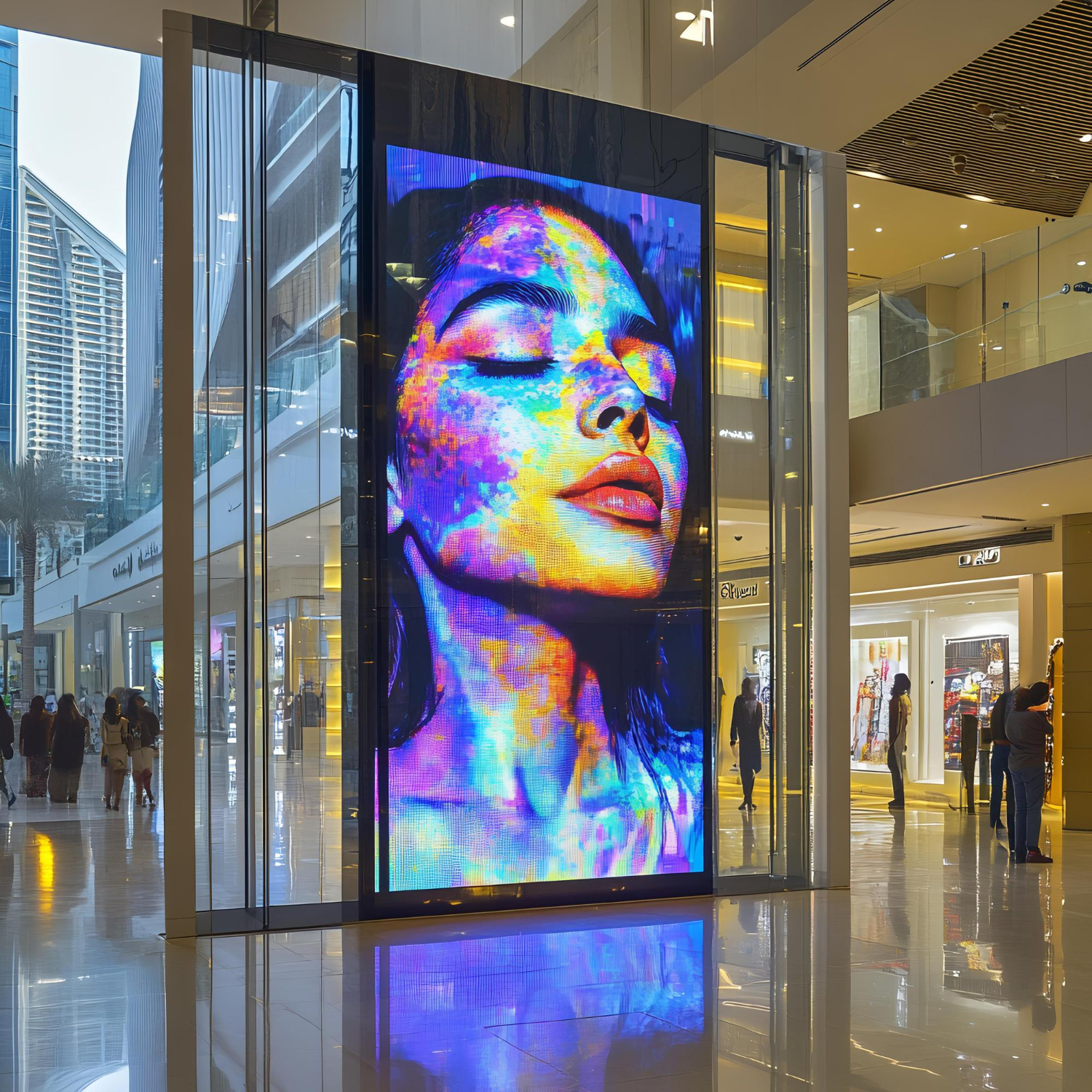
Your digital signage is competing for attention with a lot of visual noise at a trade show. That’s why high-contrast visuals are essential. Think bold colors, striking fonts, and eye-catching graphics.
- Color psychology: The colors you choose can have a profound impact on how your audience perceives your brand. For example, red is often associated with excitement and urgency, while blue projects trustworthiness and professionalism. You can create a more powerful and memorable impression by carefully selecting colors that align with your brand identity and the message you want to convey.
- Font choice matters: Not all fonts are created equal. Choose fonts that are easy to read from a distance and that complement your brand’s personality. Avoid anything too fancy or script-like that could leave attendees squinting. Bold, sans-serif fonts are often a safe bet, as they are both easy to read and visually striking.
- Less is more: Don’t overcrowd your screens with too much text or imagery. Stick to one key message per slide and leave plenty of white space for visual breathing room. This will help your content stand out and make it easier for your audience to absorb the information.
- Consider contrast: The contrast between your text and background colors is crucial for readability. Ensure that your text is easy to read against the background, especially from a distance. A high contrast ratio can help your message pop and grab attention.
- Experiment with different color combinations: Don’t be afraid to experiment with different color combinations to see what works best for your brand. Just remember to keep your overall design consistent and avoid using too many colors that can create a cluttered and confusing look.
The goal is to make your message instantly readable and memorable, even from across a crowded hall. Research shows that people are more likely to recall information that’s presented in a visually appealing way. Use a design tool like Canva or Adobe Photoshop to create professional-looking graphics, even if you’re not a design whiz.
High-contrast visuals are like a visual megaphone for your message. They cut through the clutter and ensure your signage gets noticed. CrownTV’s digital signage player is easy to use and manage, even if you’re not a tech expert. It comes with a user-friendly interface that makes it simple to create and schedule content, update playlists, and monitor the health of your displays. Plus, CrownTV’s cloud-based digital signage software known as dashboard allows you to manage your signs from anywhere in the world. So, if you’re looking for a high-quality, easy-to-use digital signage solution, CrownTV is a great option.
Strategy 4: Tap into the Buzz with Social Media Feeds
Social media is where the conversation happens. So why not bring that conversation to your booth? Incorporating live social media feeds into your digital signage is a fantastic way to boost engagement and create a sense of community.
- Showcase the love: Feature a live feed of posts that mention your brand or use your event hashtag. This is like having a wall of testimonials that updates in real-time, showing potential customers the excitement and positive experiences others are having with your brand.
- Fuel the conversation: Encourage attendees to post about your brand on social media by offering incentives, such as discounts or giveaways. This not only generates buzz but also gives you user-generated content that you can repurpose later.
- Expand your reach: Social media feeds give your brand exposure beyond the physical confines of your booth. Every time someone posts about your brand, their followers see it, potentially attracting new visitors to your booth.
- Keep it relevant: Make sure the social media feeds you display are relevant to your brand and the event. Filter out any irrelevant or inappropriate content to maintain a professional image.
Pro tip: Use a social media aggregation tool to easily pull in and curate content from various platforms. This will save you time and ensure your feed is always fresh and engaging. Incorporating social media feeds is a smart way to leverage the power of online conversations to boost engagement and build brand awareness at your trade show.
And the best part? If you can’t find an app that perfectly meets your needs, CrownTV’s team can develop a custom app just for you. That’s the beauty of digital signage solutions from CrownTV—they’re not only customizable, they’re scalable, too.
Strategy 5: Bring Your Message to Life with Motion Graphics

Static images are so last year. If you really want your digital signage to pop, incorporate motion graphics. Think animated logos, product demonstrations, or even eye-catching transitions between slides. Motion graphics are a powerful tool for capturing and holding attention. Studies show that our brains are naturally drawn to movement, making them a visual magnet that can pull people in even from a distance. When you use motion graphics in your digital signage, you’re essentially creating a mini-show that’s hard to ignore.
Beyond their ability to grab attention, motion graphics can also simplify complex ideas and make them easier to understand. By using animations, transitions, and other visual elements, you can break down complex concepts into digestible pieces that are easy for your audience to follow. This is particularly useful if you’re showcasing a technical product or service that might be difficult to explain in words alone.
However, perhaps the most powerful aspect of motion graphics is their ability to evoke emotions and create a deeper connection with your audience. By carefully crafting your animations and choosing the right music or sound effects, you can create a memorable experience that resonates with your viewers on a personal level. This is particularly important in today’s world, where consumers are increasingly demanding authentic and emotional experiences.
When using motion graphics in your digital signage, it’s important to keep them short and sweet. Aim for animations that are no longer than 10-15 seconds to keep your audience engaged and prevent information overload. The goal is to make a lasting impression, not to overwhelm your viewers with too much information. Finally, make sure your motion graphics align with your brand’s overall look and feel. Use consistent colors, fonts, and animation styles to create a cohesive and professional image. This will help your signage stand out from the crowd and reinforce your brand identity.
Pro tip: If you’re not a motion graphics expert, consider hiring a freelancer or using a template-based animation tool. There are plenty of affordable options available that can help you create stunning visuals without breaking the bank. Motion graphics add a dynamic element to your digital signage that’s hard to ignore. They’re like a visual espresso shot for your trade show booth, waking up tired eyes and injecting energy into your message.
Strategy 6: Highlight Key Information for Maximum Impact

Your digital signage at a trade show isn’t a leisurely read; it’s a fleeting opportunity to capture attention. To maximize its effectiveness, ensure your most crucial points are prominently displayed in large, easily readable text. Think impactful headlines, concise bullet points, and clear calls to action.
- The Challenge of the Crowded Trade Show Floor: Attendees at trade shows are constantly bombarded with visual stimuli. They’re walking, talking, and scanning the environment for what catches their eye. Your digital signage needs to cut through this noise and deliver its message quickly and effectively. This requires strategic highlighting of key information to facilitate instant comprehension.
- Think Billboard, Not Brochure: Imagine your signage as a billboard along a busy highway. You wouldn’t overload it with tiny text that’s impossible to read at high speeds. Similarly, your digital displays should prioritize clarity and conciseness. Utilize large, bold fonts for headlines and key takeaways, and break down complex information into easily scannable bullet points.
- Multitasking Audiences: Your audience is likely juggling multiple tasks. They may be engaged in conversations, checking their phones, or simply navigating the bustling show floor. Your signage must compete for their limited attention, so make it effortless for them to grasp the essence of your message without having to pause and read every word.
- Leverage Color and Contrast: Color and contrast are powerful tools for emphasizing key information. Employ contrasting colors to make important text stand out, and consider incorporating subtle animations or motion graphics to draw attention to specific elements on the screen.
- The Call to Action: Never leave your audience wondering what to do next. Your call to action should be unambiguous, concise, and prominently featured. Whether it’s directing visitors to your booth, prompting them to scan a QR code, or encouraging them to follow you on social media, ensure it’s clear and compelling.
- Effective Communication is Key: Highlighting key information isn’t merely about aesthetics but facilitating clear and impactful communication. By making your message easily understandable, you enhance the likelihood that your audience will take action and retain a lasting impression of your brand long after the trade show concludes.
Strategy 7: Seamless Branding for a Cohesive Experience
Your digital signage isn’t just a standalone display; it’s an extension of your brand. Ensure that its design, messaging, and overall aesthetic seamlessly align with your brand identity for a cohesive and memorable experience. This is crucial, especially in the bustling environment of a trade show, where you’re competing for the attention of trade show attendees amidst countless other exhibition booths. Your trade show presence needs to be impactful, and your digital signage plays a crucial role in achieving that.
- Consistency is King: From your logo placement to your color palette and font choices, maintain consistency across all elements of your digital signage. This reinforces your brand identity and helps attendees connect the dots between your signage and your overall brand presence. Think of it as creating a visual harmony that resonates with your brand’s core values.
- Tell Your Brand Story: Use your digital signage to tell your brand story in a visually compelling way. This could involve showcasing your company’s history, highlighting your unique selling points, or featuring customer testimonials. This is a fantastic opportunity to leverage the power of storytelling to captivate your audience and leave a lasting impression.
- Tailor Content to Your Audience: Understand your target audience and tailor your messaging and visuals accordingly. This will make your signage more relevant and engaging, increasing the likelihood that attendees will connect with your brand. Remember, personalization is key to grabbing attention and fostering meaningful interactions.
- Integrate with Your Booth Design: Your digital signage shouldn’t look like an afterthought. Integrate it seamlessly into your overall booth design to create a cohesive and immersive experience for visitors. Think of it as a piece of the puzzle that completes the picture of your trade show booth ideas. You can even turn your digital signage into interactive games to attract visitors and add a playful element to your exhibition booth.
- Extend Your Brand Beyond the Booth: Consider using QR codes or other interactive elements to direct attendees to your website or social media channels, where they can learn more about your brand and engage with your content. You can also include contact details on your signage and offer promotional materials to entice visitors to take the next step. A fun idea is to set up a photo booth with your branding, encouraging attendees to share their photos on social media and further amplify your reach.
Pro tip: Develop a brand style guide for your digital signage to ensure consistency across all displays and content. This will help maintain a professional look and feel, even if multiple people are involved in creating the content.
Seamless branding elevates your digital signage from a mere display to a powerful brand ambassador. It creates a memorable and impactful experience that reinforces your brand identity and leaves a lasting impression on your audience.
Conclusion: Level Up Your Trade Show Game
You’re now armed with seven proven strategies to transform your digital signage from forgettable to unforgettable. It’s not just about having a screen; it’s about creating an experience that captivates, engages, and leaves a lasting impression.
And if you need help bringing your vision to life, don’t hesitate to reach out. CrownTV offers expert implementation services, from project planning and screen selection to content creation and ongoing support. We’ll work with you every step of the way to ensure your digital signage makes a splash at your next trade show.
Let’s Recap the Highlights:
- Dynamic content rotation: Keep things fresh and exciting to hook those short attention spans.
- Interactive touchscreens: Transform passive viewers into active participants.
- High-contrast visuals: Cut through the noise with bold colors and clear fonts.
- Social media feeds: Tap into the buzz and extend your reach beyond the booth.
- Motion graphics: Bring your message to life with eye-catching animations.
- Key information highlights: Make your message clear and concise for busy attendees.
- Seamless branding: Create a cohesive experience that reinforces your brand identity.
Now, go forth and conquer the trade show floor with your digital signage prowess.

