Digital menus aren’t the future. They’re the present. But most places that put them up still get it wrong. Menus flash. Screens glow. But sales don’t budge. If anything, a poorly built digital menu board can slow things down, confuse customers, and quietly kill conversions. It’s not about having screens on the wall. It’s about what you put on them — and how you set them up.
The hard truth? You don’t need more bells and whistles. You need a smarter strategy. This article breaks down exactly what’s going wrong — and how to turn your screens into sales machines.
Here’s what we’ll cover:
- The top 5 mistakes restaurants make with digital menus
- How psychology and design impact food sales
- Fix-it strategies that work — layout tips, pricing hacks, and content tactics
- What a high-converting digital menu board actually looks like
- How to set up your system for speed, simplicity, and higher margins
By the end, you’ll know how to cut out the guesswork and build a menu that pushes customers to order faster, spend more, and come back again. Let’s break it down.
5 Mistakes That Tank Your Digital Menu Board
Digital menus should speed things up. Sell more food. Boost margins. But when they miss the mark, they do the exact opposite.
In the restaurant business, where margins are razor-thin, and food costs are constantly rising, every decision on the screen impacts customer satisfaction. A well-structured menu display on a TV screen isn’t a luxury anymore — it’s a requirement. Yet, many in the restaurant industry still treat their digital menus like decorations instead of high-performing tools. Whether you’re running a single unit or managing multiple restaurant chains, these mistakes add up fast — especially for a failing restaurant trying to stabilize revenue at the cash register.
Let’s break down the five most common mistakes that quietly hurt sales, frustrate customers, and leave money on the table — all without you realizing it.
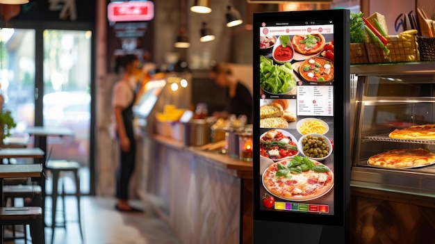
- Cramming Too Much on the Screen: The goal isn’t to showcase every item you offer. It’s to move people through decisions quickly. A cluttered screen forces your customers to pause and scan. They second-guess. They squint. And when the clock’s ticking in a fast-moving line, indecision is the enemy. Menus that try to say everything ends up saying nothing well.
- Ignoring Visual Hierarchy: Your eyes follow patterns. Every customer scans a menu in predictable ways. But if there’s no hierarchy — no visual cues guiding the eye — nothing stands out. All the items fight for attention. And the customer walks away with whatever’s easiest, not what’s most profitable.
- Rotating Slides Too Quickly: If the screen changes before someone’s finished reading, the whole setup backfires. Quick loops lead to confusion. People miss items. They get flustered. They hold up the line or default to whatever they caught at the last second. That’s not a menu — it’s a guessing game. Screens that rotate too fast burn through attention without closing the sale.
- Using Low-Contrast or Hard-to-Read Fonts: Some menus look sleek but break down in practice. Thin fonts, light text on light backgrounds, or overly stylized typefaces might match your brand, but they kill legibility. Customers won’t squint to decode your menu. They’ll skip the struggle and pick whatever’s readable. That’s lost control over your sales strategy.
- Forgetting to Prioritize High-Margin Items: Digital menus should do more than list food. They should push your most profitable items into the spotlight. However, many restaurants treat the screen like a static version of a paper menu. No strategy. No focal points. No push. Without intent, you lose your edge — and your upsell opportunities vanish. When you ignore commercial screens as a strategic sales tool, you let that valuable screen space go to waste.
Each of these mistakes chips away at your conversions. But stack them together? Now, you’re not just losing sales — you’re setting fire to potential.
How Menu Psychology Shapes What People Order
You’re not just selling food. You’re selling decisions. And every decision is shaped by the way your menu looks, feels, and flows. That’s where psychology and design step in — not as buzzwords, but as direct levers to pull up your average ticket size.
People Buy With Their Eyes
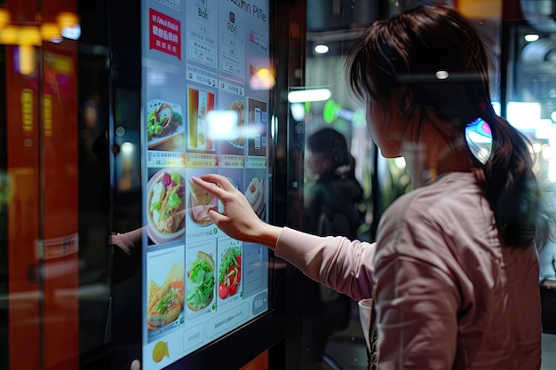
The human brain processes visuals 60,000 times faster than text. Before someone reads a single word, they’ve already formed an opinion about what looks good, what feels expensive, and what feels worth it. That’s why high-quality photos work. Not because people need to see every dish, but because visuals anchor value. A sharp image of your best-selling burger can raise perceived quality, boost cravings, and pull more people toward that item.
But it cuts both ways. Overuse of photos or poor lighting can make your menu look cheap or overwhelming. Use images strategically. Use them to sell.
Layout Can Push or Pull Profits
Where you place items on the screen changes what people buy. The top right corner — known as the “sweet spot” — gets the most attention. That’s where your high-margin items should be. Mid-screen items perform better than those buried at the bottom or crowded into corners.
And grouping similar dishes (like burgers, bowls, or breakfast combos) helps customers move faster, with less cognitive effort. Menus that guide attention reduce hesitation. And when there’s less friction, there’s more conversion.
Anchoring Sets the Stage for Bigger Orders
Anchoring is a pricing trick that works on comparison. Here’s how: List a premium combo first. Then follow it with a mid-tier option that’s still profitable — but feels like a deal by comparison. That shift in perception can nudge people upward without them realizing it.
A well-anchored menu doesn’t push. It pulls the customer up the pricing ladder by setting expectations early.
Color Choice Can Trigger Cravings
Red grabs attention. Yellow sparks hunger. Blue? It tends to suppress appetite. These aren’t design preferences. They’re psychological responses baked into how we process color. A study found that color influences up to 90% of snap judgments about a product.
That’s a massive factor when you only have a few seconds to make a sale. Smart menus use color to point attention, frame value, and trigger the right emotions.
Typography Controls Pace and Focus
Large, bold headers guide the eye. Short descriptions keep attention. White space lets people breathe. When text gets too dense or stylized, your customer has to work harder to make a decision — and that’s when confusion creeps in. The more intuitive your design, the faster people order. And faster orders don’t just help the kitchen — they mean more people served and more money made.
Design isn’t decoration. It’s strategy. And when you pair design with behavioral cues, you don’t hope customers spend more — you set up your system to push them there.
Fix What’s Broken with Layout, Pricing, and Content
Digital menu boards don’t fail because of bad food. They fail because of bad systems. Design decisions that seem minor — font size, content order, slide timing — directly affect your average order value, order speed, and customer experience.
Here’s how to fix what’s broken and build a high-converting menu board that works under pressure.
Use Layout to Control the Eye
Your screen layout is a silent salesperson. If you don’t direct the eye, you let revenue leak. Here’s the problem: Too many digital menus are built like posters. No visual hierarchy. No intentional flow. And no strategy guiding what customers see first, next, and last.
What to do:
- Establish clear zones — Use a three-part grid: top (branding or category), center (main items), bottom (add-ons or limited-time offers).
- Follow the ‘F’ pattern — Studies show customers scan screens in an “F” shape: left to right, then downward. Position your most profitable or signature items in these zones.
- Keep item groupings tight — Don’t scatter related items. A breakfast combo doesn’t belong next to a smoothie or a kids’ meal.
Why it works: Humans process visual information through spatial memory. A consistent layout reduces cognitive effort, builds familiarity, and makes it easier to locate the most valuable items.
Pro tip: Use alignment and spacing to create rhythm. Uneven columns, floating text, or mismatched images break the scanning pattern and slow down the decision.
Use Anchoring to Guide Price Perception
Anchoring isn’t manipulation — it’s how the brain works. People don’t evaluate prices in isolation. They compare. And when you set the reference point, you control what “expensive” looks like.
What to do:
- Start with the highest-priced combo or entrée in each category. Then, follow with the item you actually want to move.
- Use three-tiered pricing — small, medium, large — and make the medium only slightly cheaper than the large. That nudges customers toward the most profitable option.
- Bold the second item if it’s the sweet spot. That’s the one most customers should land on after anchoring.
Why it works: The first number seen sets the baseline. When a customer sees a $17 steak sandwich first, the $13 burger that follows feels like a deal — even if it carries higher margins.
Pro tip: Avoid pricing your menu based on cost-plus margins. Price is based on perceived value, and use anchoring to make that perception work for you.
Strip Down Descriptions to Push Decisions
Digital menus aren’t the place to be poetic. They’re designed for speed. Overwritten copy slows the decision-making process. Too little detail, though, and people get confused or skip the item entirely. You need to strike a balance.
What to do:
- Use one strong benefit or descriptor per item. “Double-stacked Angus beef. House-made chipotle aioli.” Short. Punchy. Descriptive.
- Lead with sensory triggers — Texture, flavor, or exclusivity sell more than ingredient lists.
- Avoid line breaks or wrapping text — On screens, broken text flows cause friction.
Why it works: The brain works best with short bursts of information. Chunking text into visual units increases retention and drives faster action.
Pro tip: Use a single consistent sentence structure across the menu — it trains customers on how to scan. Example: [Primary noun] + [Descriptive phrase] + [Unique value].
Limit Slides to Increase Clarity
A menu that rotates too much feels like chasing a moving target. If the customer has to wait for a slide to return so they can finish reading, you’ve already lost them.
What to do:
- Stick to 3–5 screens total, max. Anything more, and it turns into a slideshow, not a menu.
- Set rotation timing between 8–12 seconds per slide, depending on content density.
- Group items by mealtime or theme, not by category. “Breakfast,” “Combos,” and “Add-ons” work better than 10 screens labeled “Entrees A–D.”
Why it works: Too many slides increase cognitive load. Customers start scanning for patterns, not products — and important items fall through the cracks.
Pro tip: Use static zones for evergreen items (like bestsellers) and rotating zones for promos or seasonal menu offerings. That keeps the core consistent while still letting you push specials.
Use Color and Contrast to Drive Focus
The goal of color isn’t style. It’s focus. Your color choices should pull the eye to what matters, not decorate the screen.
What to do:
- Use high contrast between background and text. Black on white, white on red — never light on light or gray on gray.
- Apply warm tones (red, yellow, orange) sparingly to create urgency and appetite.
- Reserve color for callouts — like “new,” “bestseller,” or “limited time.”
Why it works: Color triggers emotion and directs attention — but only if it’s not overused. Too many colors make nothing stand out.
Pro tip: Color-code your categories subtly: blue for breakfast, red for combos, green for sides. That creates an internal system your customers follow without thinking about it.
What a High-Converting Digital Menu Board Looks Like
A high-converting digital menu board doesn’t overwhelm you. It guides. It simplifies choices, directs attention, and increases the average check size — all while keeping the line moving.
Let’s break down the structure of a screen that doesn’t just display food — it moves it.
Screen Structure That Prioritizes Profit
Every inch of digital space should work toward one goal: making high-margin items easier to spot and quicker to choose. Here’s how a well-structured screen typically breaks down:
| Screen Zone | Function | Best Use |
| Top Header | Orientation & branding | Category title, logo, or meal type |
| Center Focus Area | Core selling space | 3–5 top-selling or high-margin items |
| Bottom Strip | Reinforcement & promotions | Add-ons, combos, limited-time offers |
| Side Panels (if used) | Cross-sells or upsells | Drinks, desserts, extras |
Key tips:
- Stick to a three-column layout to balance readability and item density.
- Avoid centering everything — left-aligned content is faster to scan.
- Keep item counts between 6–10 per screen to prevent decision fatigue.
Visual Hierarchy That Leads the Eye
Design isn’t just visual. It’s directional. The right hierarchy pulls the eye toward what you want people to buy.
Use this visual hierarchy formula:
- Item title – Large, bold, left-aligned
- Price – Right-aligned, same line, medium weight
- Description – One line max, smaller font, neutral color
- Visual indicator – “New,” “Staff Pick,” or icon for vegetarian/spicy
Visual cues to reinforce:
- Use bold or colored text to highlight high-margin menu items
- Add subtle borders or icons to frame bestsellers without shouting
- Keep consistent padding and spacing — misalignment creates friction
Timing, Flow, and Screen Rotation Strategy
A strong menu board also knows when to say what.
Slide timing strategy:
- Keep each slide on the screen for 8–12 seconds
- Sequence your slides by daypart or category, not by item count
- Always show bestsellers on every loop — repetition increases selection rates
Bonus tip: Use a static zone on multi-screen setups to anchor key items across all slides. It gives repeat customers a consistent reference point, and it reinforces ordering habits.
When your board nails layout, hierarchy, and flow, customers stop guessing. They stop stalling. They order more — and they order faster.
How to Set Up Your Digital Signage System for Speed, Simplicity, and Higher Margins
DIY digital signage is a trap. It looks cheaper. It feels flexible. But it leaves too much room for error — technical gaps, inconsistent design, poor screen performance, and legal compliance issues that you didn’t even know existed until a warning showed up in your inbox.
And once your digital menu underperforms, it doesn’t matter how great the food is. You’ll bleed revenue slowly — and silently.
Skip the DIY Setup and Work with a Pro
Digital signage isn’t about plugging in a TV and uploading a menu slide. That shortcut leads to cluttered displays, off-brand visuals, or worse — menus that confuse more than they convert.
Restaurants that try to piece everything together themselves usually face one or more of the following:
- Unreliable software that crashes mid-service
- Media players that lag, freeze, or fail altogether
- Hardware and screen placements that miss ADA or zoning compliance
- Inflexible content systems that take hours to update
- Legal exposure due to non-compliance with digital display codes
If you care about brand control, uptime, and long-term scale, you need a U.S.-based restaurant signage provider that’s built to handle all of it — the tech, the compliance, and the restaurant-specific challenges. That’s where most companies fall short.
Why CrownTV Is the Right Choice — And Others Don’t
Running a restaurant leaves zero room for guesswork. The screen needs to load. The menu needs to be updated. The system needs to work — not next week not after a ticket is filed, but now. That’s where most digital signage vendors fall apart.
They offer generic templates, cookie-cutter software, and offshore support that doesn’t understand how a kitchen runs during lunch rush. CrownTV is built differently — built for restaurant environments, down to the wire.
Whether you’re managing a single QSR or scaling digital menus across 40+ franchise locations, CrownTV gives you exactly what you need:
- Fast updates that don’t slow down your team
- Fail-proof media players that run nonstop during peak hours
- Layouts and templates engineered to drive more upsells
- Hardware installations that match your service flow and screen visibility
- Complete compliance with U.S. accessibility and signage regulations — so you don’t get hit with fines or forced takedowns
And all of that is managed through one secure dashboard, so your GMs or corporate marketing team can update pricing, promos, or seasonal menus in minutes without touching a USB stick. This isn’t a one-size-fits-all platform trying to work for food service. CrownTV is a restaurant-focused solution that helps you move food faster, upsell better, and stay operational under pressure.
Set Your Restaurant Up to Win
Digital menu boards only work when they’re fast, flexible, and built with intention. That starts with choosing a signage partner who understands the business and owns the technical execution from end to end.
CrownTV helps restaurant owners:
- Roll out high-performing digital menus without tech headaches
- Scale screen deployments across multiple locations effortlessly
- Push updates instantly from one dashboard, no matter where you are
- Keep systems running smoothly with zero-hassle media players
- Stay 100% compliant with U.S. signage and accessibility regulations
In short, we make digital menus work the way they’re supposed to. No clunky systems. No legal gray areas. No design mistakes that drag sales down. CrownTV builds digital signage that sells.
Wrapping Up: Build Menus That Sell with CrownTV
Fixing a broken digital menu isn’t guesswork — it’s a process. And if you’ve made it this far, you’re already steps ahead of most restaurants still trying to figure things out on the fly. You’ve seen where things go wrong, what drives behavior, and how to build commercial-grade screens that move orders, not slow them down.
Let’s recap the most important takeaways:
- Too many digital menus are packed with clutter, poor timing, and zero hierarchy — which confuse customers and kill conversions
- Menu psychology shapes what people order — visual cues, pricing structure, and color impact decisions more than most realize
- You can fix weak boards with layout control, clean pricing anchors, strategic descriptions, and simplified rotation
- High-converting screens aren’t flashy — they’re functional, structured, and built to push profit
- DIY signage setups leave restaurants exposed in both performance and compliance
- CrownTV delivers the best digital signage for restaurants-ready solution that handles software, hardware, installation, and U.S. signage law — all in one place
Digital menus can either cost you money or make you make more of it. The difference comes down to who sets up the system. CrownTV helps restaurants take control of their screens — and turn them into tools that sell, scale, and simplify.