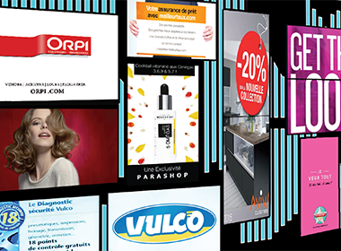
Digital signage is only as effective as the content it displays. Screens are nothing but a medium, while content has the power to shape the customer experience and inspire action. You may have a few promotional graphics and social media feeds to share on your screens, but how do you create truly compelling digital signage content?
Knowledge of a few tools and best practices is a good start, and you don’t have to be a design pro to implement them. Here’s how to create digital signage content that rocks.
Take advantage of easy-to-use tools
We’re fortunate to live in a time when great design tools are widely available, allowing even the most novice content creators to try their hand at graphic design. Many of these tools are cloud-based, allowing you to access them anywhere and share your designs with collaborators.
Popular and easy-to-use design tools to create digital signage content include:
Canva
Canva has been called “the easiest to use design program in the world” and a tool that “enables anyone to become a designer.” Free to use and popular among designers and non-designers alike, Canva’s features include:
- A simple drag-and-drop interface
- A large selection of pre-designed layouts and templates
- Ability to upload your own graphics
- Hundreds of free backgrounds, shapes, lines, frames, icons, stock photos, illustrations and more, with premium elements costing only $1 each
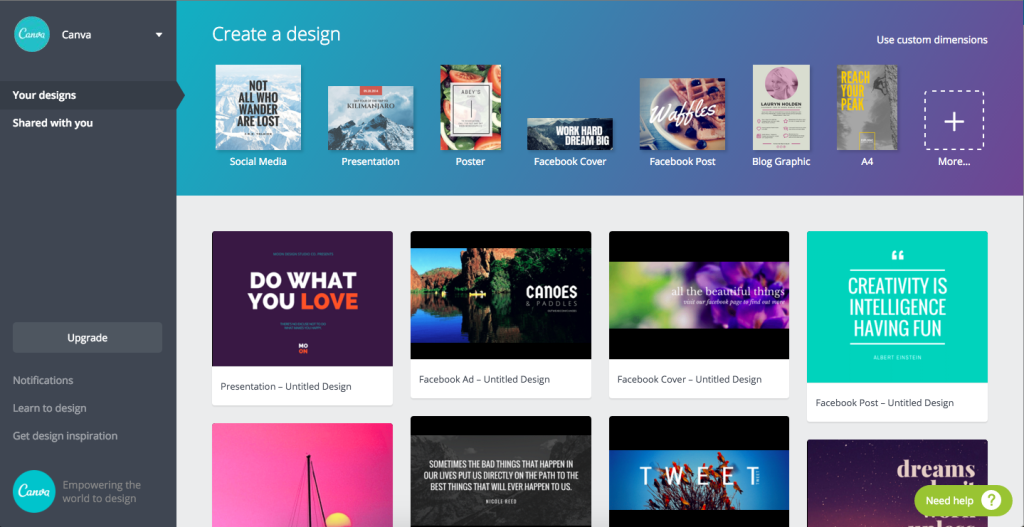
Canva is handy for creating clean yet effective branded content in a short amount of time. Browse their Design Stream for inspiration.
PowerPoint or Google Slides
Love it or hate it, PowerPoint is a mainstay and one of the more user-friendly members of the Microsoft Office suite. You can use it to create just about any static digital signage content, from menus to building directories to daily trivia. Slides may be saved as JPEG or PNG files. Looking for a free equivalent? Try Google Slides.
Adobe Illustrator
Adobe Illustrator, now cloud-based as part of Adobe Creative Cloud, is a more sophisticated tool but relatively easy to learn as compared to Photoshop. Because Illustrator is vector-based, it’s useful for creating graphics that need to be displayed at different sizes without losing quality. That’s a must for digital signage content, which may need to be displayed on multiple screens of various dimensions.
Incorporate branding wherever you can
When people see your digital signage content, you want them to know who created it. If your content draws attention, why not get some marketing out of it as well? Incorporate branding by including your business’ logo, color scheme, fonts and any other design elements that identify your brand.

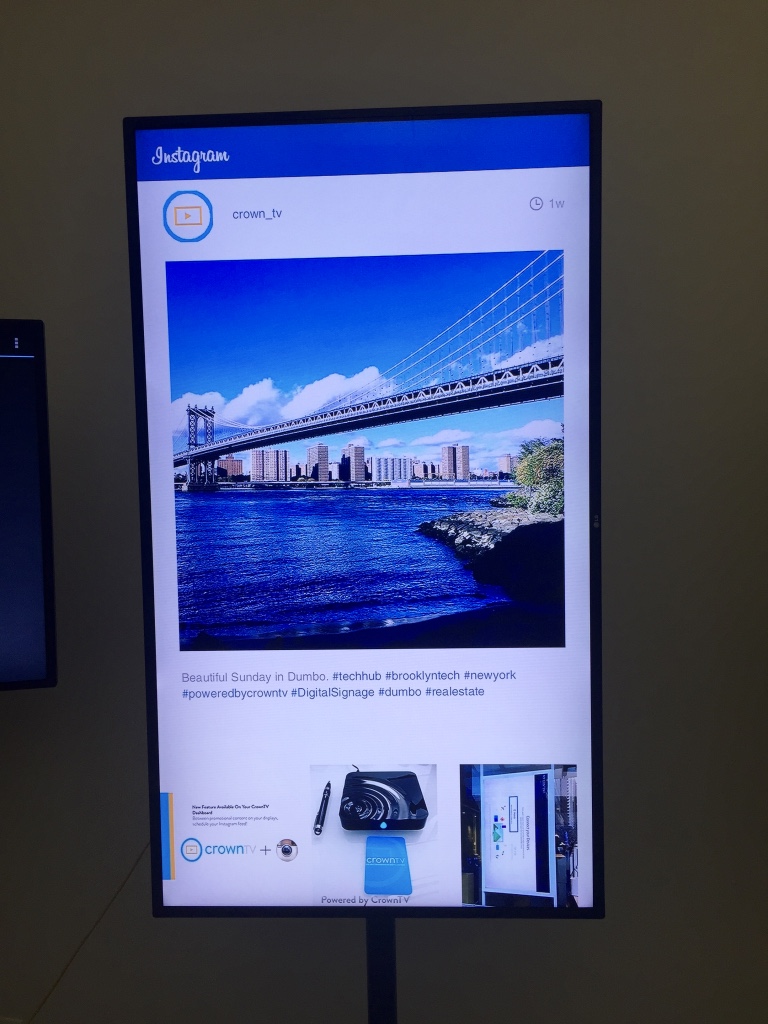
Branding can also be achieved through a social media wall by displaying branded hashtags, like in the example pictured below. This strategy generates exposure for your brand on both your screens and the web.

Your branding can be subtle or obvious, but it’s crucial either way. Focus on making your company recognizable.
Acknowledge your audience
Digital signage content, by its very nature, is easy to customize and edit at will. Take advantage of this asset by crafting content that acknowledges your audience.
If you’re using digital signage for internal communications, create content that recognizes team members who go above and beyond or have something to celebrate. Create charts and graphs to show numerical accomplishments, make a digital Employee of the Month award, or wish employees a happy birthday. It’s a worthwhile use of digital signage, as employee recognition has been linked to better morale, productivity and retention.
For retail, salons and spas, restaurants and other customer-facing businesses, acknowledging customers can be done by sharing their testimonials, featuring their social media posts, or simply thanking them for stopping by. It may not be as personalized as workplace digital signage content, but still more so than static paper signage.
For any digital signage content requiring audience participation, be sure to tell them what to do via a clear, concise call-to-action.
Localize, localize, localize
It’s important to consider the location of your displays, whether you have just one location or several across the country, so your content doesn’t seem too generic or detached. Try to create content that’s unique to each location in its graphics and text.
Say you’re a retail chain with stores throughout the United States. You may want to use a photo of South Beach as the background for your Miami location’s content, a photo of the Manhattan skyline for your New York location, etc. If you’re a hotel chain, inform your guests of local weather and events at the hotel or in the surrounding area. In waiting rooms, display RSS feeds of the local news. When displaying social media, stream local accounts, photos and hashtags.
Localization is another way of personalizing digital signage content and acknowledging the audience. And with CrownTV’s software, it’s easy to organize your content by location through the use of Display Groups.
Play the numbers game
There’s a reason list articles or “listicles” have exploded in popularity and are the most preferred form of headline. Numbers are highly effective for gaining audiences’ attention and getting messages across. Our brains love them, because they’re quick to read and package information into short, easy-to-consume characters. They give credibility and specificity to your content while taking up less space than words.
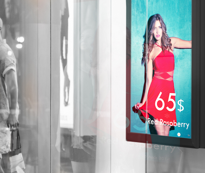
Some quick tips for using numbers in your digital signage content:
- Always use Arabic numerals (1, 2, 3, 10…) rather than writing out numbers with words.
- When sharing statistics, use exact data when you can and avoid rounding off to the nearest ten. Odd numbers tend to be more credible than even ones. Think “27% increase in sales” as opposed to “30% increase in sales” – which sounds more accurate, and which one sounds made up?
- Use numbers for social proof if your business has a strong online following. For example, if you have a graphic asking customers to like your page on Facebook, include how many likes your page already has.
On the internal communications side, incorporate numbers into your digital signage content by displaying key performance metrics. It’ll hold your team accountable and allow them to visualize goals.
Take context into account
When you create your digital signage content, think about the screen it’ll be displayed on. Where is the screen located? Who will be looking at it? What will they be doing while they look at it? The answers to these questions should help determine the length and substance of your content.

Content that is text-heavy and takes more than a few seconds to read is best reserved for waiting areas or long lines. Leave shorter content for places where customers come and go quickly. Content for displays placed near a point of sale (cash register, reception desk, etc.) should show tempting impulse buys. Storefront digital signage content should draw customers into your establishment by advertising sales and promotions.
Content may be king, but when it comes to digital signage, so is context.
Keep it dynamic and fresh
One major element separating digital signage from traditional signage is its ability to display dynamic content. If you’re only displaying static content on your screens, why even use digital signage? Dynamic content captures attention, keeps viewers interested and sticks in their minds.
Customers are 10 times more likely to observe dynamic digital signage content than static messages.[1]
Examples of dynamic digital signage content are videos, animations, social media feeds or RSS feeds. The latter two are your best bet for keeping your content as fresh and exciting as possible, and they’re low maintenance. However, if you’re displaying your company’s social media account, make sure to keep it updated!
Use high-quality images that reflect your brand’s aesthetic
You want your digital signage content to reflect well upon your business’ high standards and what it does best. Try to use only the most high-resolution, high-quality, vibrant photos, especially if you deal in the business of health and beauty.

Common HD display resolutions are 1280×720, 1366×768 and 1920×1080. Try to size your images as close to the dimensions of your displays as possible.
If your own photos aren’t cutting it, there’s no shame in using stock photos. Shutterstock has a huge selection at reasonable prices, and there are plenty of free options as well.
Conclusion
Is the medium the message? Whatever you believe, digital signage doesn’t end at setting up your displays. As it becomes more common across various industries, it’s that much more imperative to optimize your digital signage content so that it sets your business apart. Following the best practices listed in this article will give you the edge you need to do so.
Did you know CrownTV offers customized templates to help you incorporate branding into your content? Request a demo today to learn more.

